
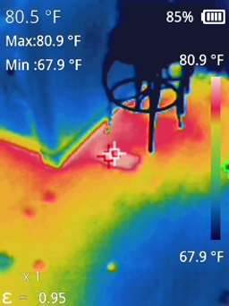
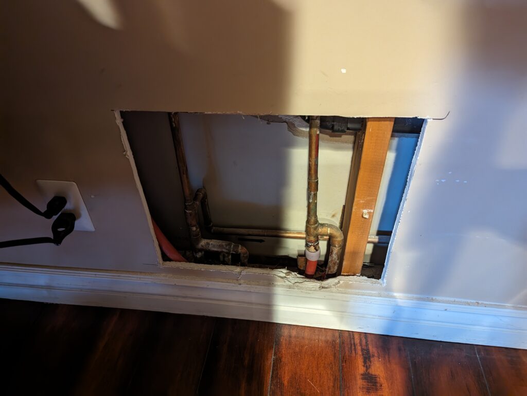
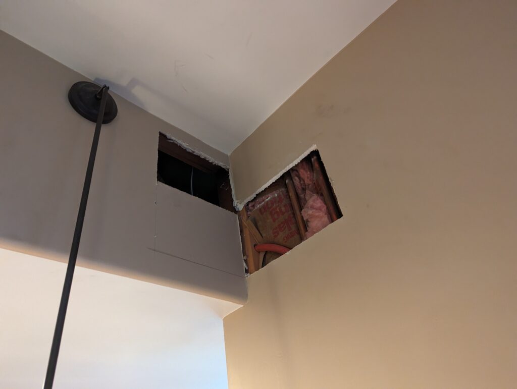
Recently, I encountered an unexpected challenge: a water leak beneath the slab of my house. The ordeal had me up until 1 AM, rerouting the line through my attic with PEX piping. Amidst this late-night task, a thought occurred to me: could machine learning and forecasting have helped me detect this leak earlier, based on my water bill consumption?
I wrote some Python code outlined below that uses statmodels and SARIMAX to predict consumption.
I now wonder why municipalities aren’t incorporating machine learning into data like this to send notices to customers in advance of potential leaks. I imagine this could save millions of gallons of water each year. Full code and explanation follows.
Data Upload and Preparation:
The program starts by uploading a CSV file containing water usage data (in gallons) and the corresponding dates. The CSV must have two column titles date and gallons in order for this to work. This data is then processed to ensure it’s in the correct format. Dates are sorted, and any missing values are filled to maintain continuity.
Creating a Predictive Model:
I used the SARIMAX model from the statsmodels library, a powerful tool for time series forecasting. The model considers both the seasonal nature of water usage and any underlying trends or cycles.
Making Predictions and Comparisons:
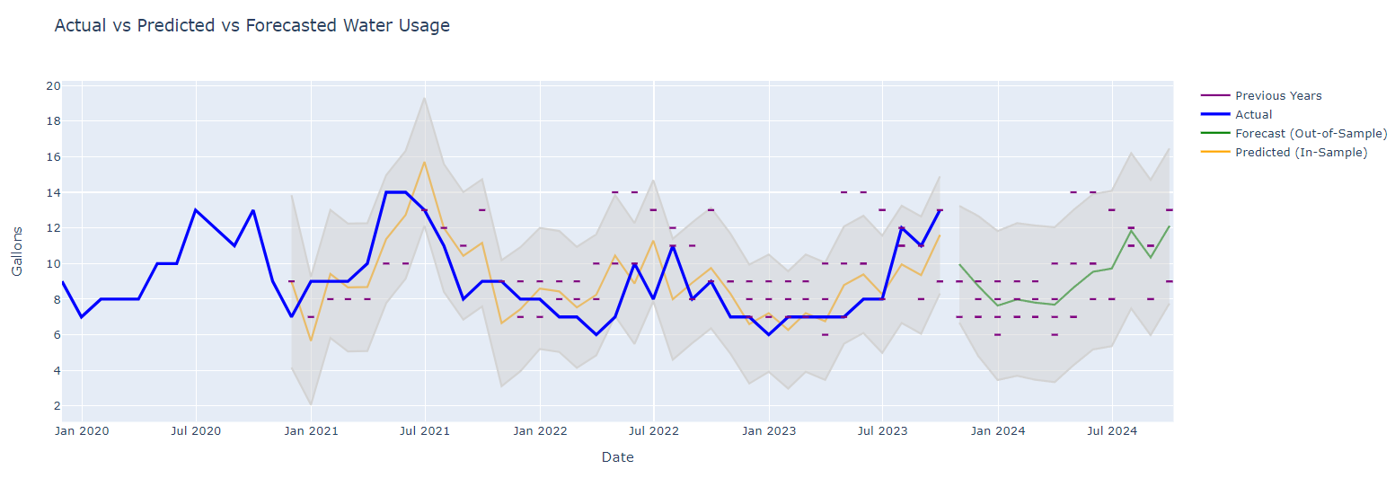
The program forecasts future water usage and compares it with actual data.
By analyzing past consumption, it can predict what typical usage should look like and flag any significant deviations.
Visualizing the Data:
The real power of this program lies in its visualization capabilities.
Using Plotly, a versatile graphing library, the program generates an interactive chart. It not only shows actual water usage but also plots predicted values and their confidence intervals.
Highlighting Historical Data:
To provide context, the chart also includes historical data as reference points. These are shown as small horizontal lines, representing the same month in previous years.
Code (Google Colab)
!pip install plotly
!pip install statsmodels

from google.colab import files
import io
import pandas as pd

uploaded = files.upload()

# Use the name of the first uploaded file
filename = next(iter(uploaded))
df = pd.read_csv(io.BytesIO(uploaded[filename]))

df = df[['date', 'gallons']]

# Convert the date column to datetime
df['date'] = pd.to_datetime(df['date'])
df.sort_values(by='date', inplace=True)

df.set_index('date', inplace=True)
df = df.asfreq('D')
df['gallons'].fillna(method='ffill', inplace=True)
df = df.asfreq('M')

import plotly.graph_objects as go
import pandas as pd
from statsmodels.tsa.statespace.sarimax import SARIMAX

# SARIMA Model for Forecasting
model = SARIMAX(df['gallons'], order=(1, 0, 1), seasonal_order=(1, 1, 1, 12))
results = model.fit()

# In-sample predictions
in_sample_predictions = results.get_prediction(start=pd.to_datetime(df.index[12]), end=pd.to_datetime(df.index[-1]), dynamic=False)
predicted_mean_in_sample = in_sample_predictions.predicted_mean
in_sample_conf_int = in_sample_predictions.conf_int()

# Forecasting for future periods (e.g., the next 12 months)
forecast = results.get_forecast(steps=12)
predicted_mean_forecast = forecast.predicted_mean
forecast_conf_int = forecast.conf_int()

# Prepare the figure
fig = go.Figure()

# Predicted data (in-sample) and confidence intervals
fig.add_trace(go.Scatter(x=predicted_mean_in_sample.index, y=predicted_mean_in_sample, mode='lines', name='Predicted (In-Sample)', line=dict(color='orange')))
fig.add_trace(go.Scatter(x=in_sample_conf_int.index, y=in_sample_conf_int['upper gallons'], fill=None, mode='lines', line=dict(color='lightgray'), showlegend=False))
fig.add_trace(go.Scatter(x=in_sample_conf_int.index, y=in_sample_conf_int['lower gallons'], fill='tonexty', mode='lines', line=dict(color='lightgray'), showlegend=False, name='Predicted CI'))

# Forecasted data (out-of-sample) and confidence intervals
fig.add_trace(go.Scatter(x=predicted_mean_forecast.index, y=predicted_mean_forecast, mode='lines', name='Forecast (Out-of-Sample)', line=dict(color='green')))
fig.add_trace(go.Scatter(x=forecast_conf_int.index, y=forecast_conf_int['upper gallons'], fill=None, mode='lines', line=dict(color='lightgray'), showlegend=False))
fig.add_trace(go.Scatter(x=forecast_conf_int.index, y=forecast_conf_int['lower gallons'], fill='tonexty', mode='lines', line=dict(color='lightgray'), showlegend=False, name='Forecast CI'))

# Actual data (make it bolder and on top)
fig.add_trace(go.Scatter(x=df.index, y=df['gallons'], mode='lines', name='Actual', line=dict(color='blue', width=3)))

# Adding Previous Years' data as small horizontal lines
legend_added = False
for current_date in df.index.union(predicted_mean_forecast.index):
    current_month, current_year = current_date.month, current_date.year
    previous_years_data = df[(df.index.month == current_month) & (df.index.year < current_year)]
    for prev_year_date in previous_years_data.index:
        y_value = previous_years_data.loc[prev_year_date, 'gallons']
        fig.add_shape(type="line", x0=current_date - pd.Timedelta(days=5), y0=y_value, x1=current_date + pd.Timedelta(days=5), y1=y_value, line=dict(color="purple", width=2))
        if not legend_added:
            fig.add_trace(go.Scatter(x=[None], y=[None], mode='lines', name='Previous Years', line=dict(color='purple', width=2)))
            legend_added = True

# Update layout
fig.update_layout(title='Actual vs Predicted vs Forecasted Water Usage', xaxis_title='Date', yaxis_title='Gallons', hovermode='closest')

# Show the plot
fig.show()