Pyfolio – AttributeError: ‘Series’ object has no attribute ‘iteritems’ & AttributeError: ‘numpy.int64’ object has no attribute ‘to_pydatetime’

Recently I was following a paper and in the example they used Pyfolio which is an awesome performance and risk analysis library in Python developed by Quantopian Inc when they were still around. Given that Quantopian is no longer around nobody is maintaining this library. I ran into a few errors and figured I would outline the solutions below in case anyone has these issues. But before I dive too deep into modifying this library you may be better off just uninstalling Pyfolio and loading Pyfolio-reloaded.

Also, if you’re interested here is an article on modifying PyFolio to output charts and data to an HTML.

Pyfolio-reloaded

pip uninstall pyfolio
pip install git+https://github.com/stefan-jansen/pyfolio-reloaded.git

First Error

Traceback (most recent call last):
  File "/home/shared/algos/ml4t/pairs_trading_backtest.py", line 512, in <module>
    pf.create_full_tear_sheet(returns,
  File "/opt/anaconda3/envs/ml4t/lib/python3.10/site-packages/pyfolio/tears.py", line 201, in create_full_tear_sheet
    create_returns_tear_sheet(
  File "/opt/anaconda3/envs/ml4t/lib/python3.10/site-packages/pyfolio/plotting.py", line 52, in call_w_context
    return func(*args, **kwargs)
  File "/opt/anaconda3/envs/ml4t/lib/python3.10/site-packages/pyfolio/tears.py", line 496, in create_returns_tear_sheet
    plotting.show_perf_stats(returns, benchmark_rets,
  File "/opt/anaconda3/envs/ml4t/lib/python3.10/site-packages/pyfolio/plotting.py", line 648, in show_perf_stats
    for stat, value in perf_stats[column].iteritems():
  File "/opt/anaconda3/envs/ml4t/lib/python3.10/site-packages/pandas/core/generic.py", line 5989, in __getattr__
    return object.__getattribute__(self, name)
AttributeError: 'Series' object has no attribute 'iteritems'

Process finished with exit code 1

This is the first error I received which was generated by this line of code:


pf.create_full_tear_sheet(returns, 
                          positions=positions, 
                          transactions=transactions, 
                          benchmark_rets=benchmark.loc[returns.index], 
                          estimate_intraday=False)

This can be fixed by modifying the file, /opt/anaconda3/envs/ml4t/lib/python3.10/site-packages/pyfolio/plotting.py

The line of code I’m going to change is as follows:

Existing:
for stat, value in perf_stats[column].iteritems():

New:
for stat, value in perf_stats[column].items():

Second Error:

Traceback (most recent call last):
  File "/home/shared/algos/ml4t/pairs_trading_backtest.py", line 512, in <module>
    pf.create_full_tear_sheet(returns,
  File "/opt/anaconda3/envs/ml4t/lib/python3.10/site-packages/pyfolio/tears.py", line 201, in create_full_tear_sheet
    create_returns_tear_sheet(
  File "/opt/anaconda3/envs/ml4t/lib/python3.10/site-packages/pyfolio/plotting.py", line 52, in call_w_context
    return func(*args, **kwargs)
  File "/opt/anaconda3/envs/ml4t/lib/python3.10/site-packages/pyfolio/tears.py", line 504, in create_returns_tear_sheet
    plotting.show_worst_drawdown_periods(returns)
  File "/opt/anaconda3/envs/ml4t/lib/python3.10/site-packages/pyfolio/plotting.py", line 1664, in show_worst_drawdown_periods
    drawdown_df = timeseries.gen_drawdown_table(returns, top=top)
  File "/opt/anaconda3/envs/ml4t/lib/python3.10/site-packages/pyfolio/timeseries.py", line 1008, in gen_drawdown_table
    df_drawdowns.loc[i, 'Valley date'] = (valley.to_pydatetime()
AttributeError: 'numpy.int64' object has no attribute 'to_pydatetime'

To fix this I modified this file /opt/anaconda3/envs/ml4t/lib/python3.10/site-packages/pyfolio/timeseries.py

The issue is within the function get_max_drawdown_underwater() the code is returning the index position for valley and it needs to be the date not the index position itself. The fixed code is below


def get_max_drawdown_underwater(underwater):
    """
    Determines peak, valley, and recovery dates given an 'underwater'
    DataFrame.

    An underwater DataFrame is a DataFrame that has precomputed
    rolling drawdown.

    Parameters
    ----------
    underwater : pd.Series
       Underwater returns (rolling drawdown) of a strategy.

    Returns
    -------
    peak : datetime
        The maximum drawdown's peak.
    valley : datetime
        The maximum drawdown's valley.
    recovery : datetime
        The maximum drawdown's recovery.
    """

    valley_idx = np.argmin(underwater)  # end of the period, as an index position
    valley_date = underwater.index[valley_idx]  # convert index position to timestamp
    # Find first 0
    peak = underwater[:valley_date][underwater[:valley_date] == 0].index[-1]
    # Find last 0
    try:
        recovery = underwater[valley_date:][underwater[valley_date:] == 0].index[0]
    except IndexError:
        recovery = np.nan  # drawdown not recovered
    logging.info(f'get_max_drawdown_underwater is returning \n {peak} \n {valley_date} \n {recovery}')
    return peak, valley_date, recovery

Using Simple Multiple Linear Regression Models to Estimate Missing Data

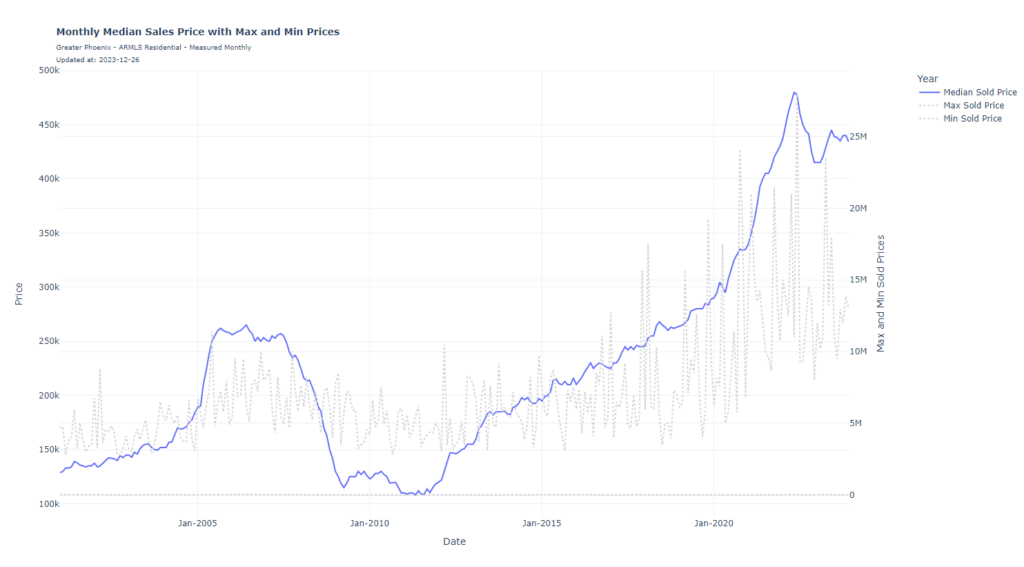
Occasionally I will want to see long-term historical data so I can better interpret the history of something I’m trying to analyze. I wrote some code a while back that analyzes the increased cost of monthly housing payments due to increases in mortgage rates. However, recently I wanted to re-write this code but apply it to the Arizona housing market. The only issue was I was only able to download historical data for Arizona median house sales prices back to 2001. As well I could only download Real Per Capita Personal Income for Arizona back to January 2008. So in these examples below what I’m going to do it use highly correlated datasets with a close enough relationship to my dependent variables to estimate these values back a few decades. The whole purpose of this dataset is to get an idea of home ownership affordability to predict high and low housing prices.

When I looked at the historical median sales price of houses in Arizona I didn’t feel this limited dataset gave quality insight into the high cost of housing relative to high real estate prices combined with high mortgage rates. As shown in the chart below you can see the national payment-to-income ratio going back to 1971. The AZ dataset is too limited.

You can see that house payments relative to income are historically higher than they have ever been by a significant margin. The Arizona dataset shows this but it’s not quite as apparent due to the limited timeframe (only going back to 2001).

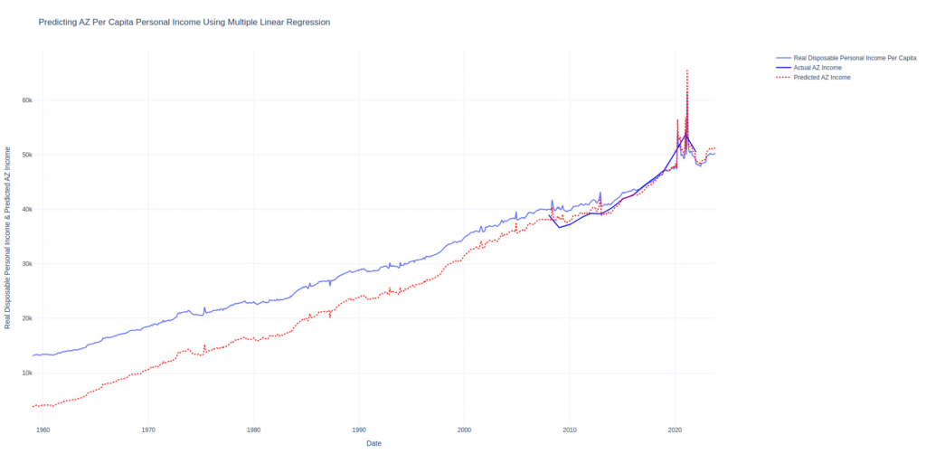
Two datasets are missing historically here we’re going to use multiple linear regression to estimate. To establish the Real Per Capita Income for Arizona I will use just linear regression with one regressor, Real Disposable Personal Income: Per Capita (A229RX0) The reason I’m using this regressor is the data is updated monthly and goes back over 60 years. This means my plots will have large historical data plus they will be up to date rather than being delayed a few years since the data we’re estimating, Real Per Capita Personal Income for Arizona (AZRPIPC), is only updated once per year.

In this chart, our actual data is the solid dark blue line. Our regressor is the solid light blue line and the predicted data is the dotted red line. The MAPE on this data is 3.21%. Keep in mind this should interpreted lightly as this value is on all training data. There is no train/test dataset. I’m just looking for a projection of historical values.

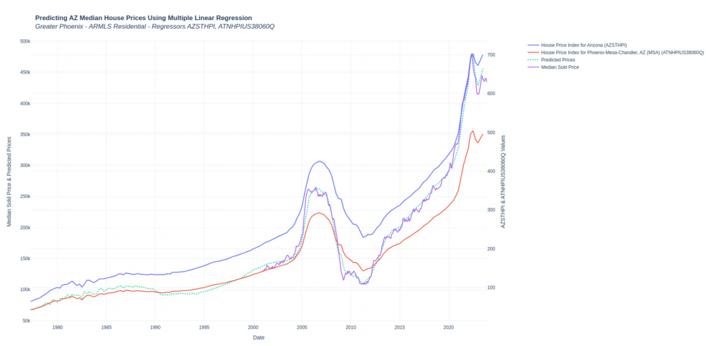
The next dataset that I’m missing historical data for is the median sales price of a house in Arizona. I can pull monthly values from ARMLS back to 2001. So the goal is to use multiple linear regression using All-Transactions House Price Index for Arizona (AZSTHPI) and All-Transactions House Price Index for Phoenix-Mesa-Chandler, AZ (MSA) (ATNHPIUS38060Q) as regressors. The MAPE on this model is 3.21% on training data.

You can see in the chart that I only have the median house prices going back to 2001. My regressors are in blue and red where the predicted historical values of median house prices are in dotted teal.

Credit Card Arbitrage: Turning a 0% APR Offer into $2,000 in Free Cash

The Offer

American Express extended a 0% APR credit card offer to me, valid for 12 months. This card isn’t just about the interest-free period; it also offers approximately 5% cash back on purchases. To his the first bonus you have to spend $5,000 which earns you a $250 bonus. With a credit limit of $30,000 and no interest for a year, this presents me with an opportunity.

Strategy

In a previous post, I discussed how to earn a risk-free 5.5% in a high-yield savings account (HYSA). You can find that discussion here: Maximizing Cash Returns in a Rising Rate Environment. But in this scenario, since we have a whole year before we need to pay off the balance, we can look at even more lucrative options, like a 6-month CD yielding 5.66%. So the strategy is simple. You take the money you otherwise would have spent and paid off and instead use this card. You extend the balance to its maximum of $30,000. Now with the saved cash you simply put this into a HYSA or CD. Before the credit card starts to accrue interest, month 12, you simply pay it off.

My Scenario

Let’s break down the numbers in my situation. If I max out the card to its $30,000 limit, here’s what happens:

  1. Cashback Bonus: On the first $5,000 spent, I trigger a $250 bonus due to the card’s cashback offer.
  2. Interest Earnings: By investing this $30,000 I would have spent in a 6-month CD at 5.66%, I would earn approximately $1,698 in interest over a year (assuming I reinvest the initial interest after 6 months).

Result

Combining the cashback bonus with the interest from the CD, we’re looking at a total gain of around $1,948 over the year. This is essentially “free money,” earned by smartly utilizing the credit card’s features and pairing them with high-yield investment options.

Risks

While this strategy sounds promising, it’s essential to consider the risks and responsibilities:

  • Credit Score Impact: Utilizing a large portion of your credit limit can impact your credit utilization ratio, a key factor in credit scoring.
  • Payment Discipline: You must make at least the minimum payments on time every month to avoid interest and fees.
  • Investment Risk: While CDs are generally safe, there’s still a risk in any investment, including the potential for early withdrawal penalties.

Conclusion

Credit card arbitrage, like the scenario I’ve outlined, can be a clever way to make your credit card work for you. However, it requires discipline, a good understanding of credit and investments, and a willingness to manage the risks involved. If done correctly, it can be a rewarding strategy for boosting your savings.


This exploration into credit card arbitrage is a prime example of how understanding and leveraging financial tools can lead to significant gains. It’s a strategy that fits well with my approach to finding and exploiting opportunities in the financial world. As always, I recommend readers do their due diligence and consider their financial situation before diving into such strategies.

Maximizing Cash Returns in a Rising Rate Environment

In this time of rising Fed rates, it’s a good time to explore the best spots for your cash. To give you a hand, I’ve compiled some auto-updating options.

To summarize: For easy access, high-yield savings accounts are hard to beat. Want to lock in a rate? Consider CDs or government bonds

For those who prioritize accessibility, high-yield savings accounts are unbeatable. And if you’re aiming for a little more yield, CDs could be your ticket. Right now, Total Direct Bank is offering a 3-month CD at 5.66%. Stretch that to a 6-month term, and West Town Bank & Trust ups the ante to 5.88%.

I’ve been a fan of keeping my cash within easy reach, so while those CD rates are attractive, I’m leaning toward Milli.bank‘s high-yield savings account at 5.5%. I’ve typically parked my funds in Vanguard’s VMFXX through my brokerage account at Vanguard, but Milli’s rates got me. Plus they appear to just be a subsidiary of First National Bank of Omaha. I’ve got some money in the 3-month CDs, but is a tiny bump in interest worth the lock-in? For me, not so much. Unless I know I won’t need the cash.

Remember, there’s a cap on insured amounts in the bank accounts—$250k per person named on the accont. So $500k per join account. Sure, the Fed always bails out the banks but why roll the dice? My strategy? Max out the savings and CDs to the insured limit, and then overflow goes into Vanguard’s VMFXX. If you’re the type to diversify, Milli.bank and Popular Direct‘s accounts are both competitive choices.

Staying informed on the optimal places for your cash is key in this climate of rate hikes. Whether you prioritize security, liquidity, or a bit extra on your return, the options are there.

I’ve created these sites that dynamically monitor for the best yield on your cash. Feel free to monitor them if you’re looking for easy updates.

My Leaky Water Bill – How to Use Machine Learning to Detect Water Leaks

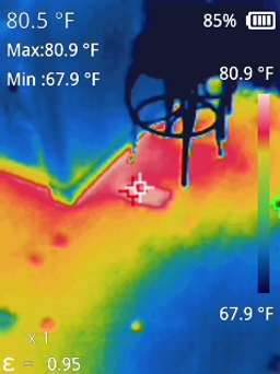
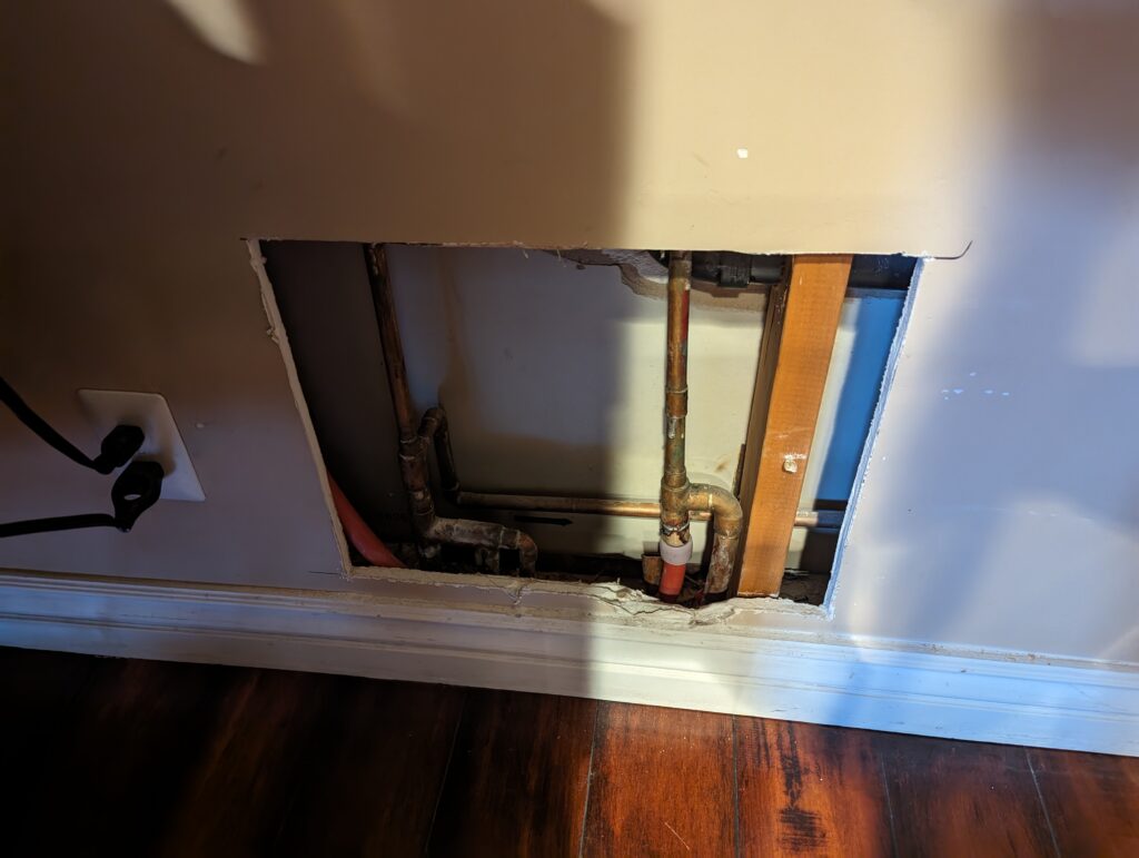
Recently, I encountered an unexpected challenge: a water leak beneath the slab of my house. The ordeal had me up until 1 AM, rerouting the line through my attic with PEX piping. Amidst this late-night task, a thought occurred to me: could machine learning and forecasting have helped me detect this leak earlier, based on my water bill consumption?

I wrote some Python code outlined below that uses statmodels and SARIMAX to predict consumption.

I now wonder why municipalities aren’t incorporating machine learning into data like this to send notices to customers in advance of potential leaks. I imagine this could save millions of gallons of water each year. Full code and explanation follows.

Data Upload and Preparation:

The program starts by uploading a CSV file containing water usage data (in gallons) and the corresponding dates. The CSV must have two column titles date and gallons in order for this to work. This data is then processed to ensure it’s in the correct format. Dates are sorted, and any missing values are filled to maintain continuity.


Creating a Predictive Model:

I used the SARIMAX model from the statsmodels library, a powerful tool for time series forecasting. The model considers both the seasonal nature of water usage and any underlying trends or cycles.


Making Predictions and Comparisons:

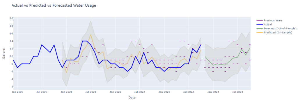
The program forecasts future water usage and compares it with actual data.
By analyzing past consumption, it can predict what typical usage should look like and flag any significant deviations.


Visualizing the Data:

The real power of this program lies in its visualization capabilities.
Using Plotly, a versatile graphing library, the program generates an interactive chart. It not only shows actual water usage but also plots predicted values and their confidence intervals.

Highlighting Historical Data:

To provide context, the chart also includes historical data as reference points. These are shown as small horizontal lines, representing the same month in previous years.

Code (Google Colab)

!pip install plotly
!pip install statsmodels

from google.colab import files
import io
import pandas as pd

uploaded = files.upload()

# Use the name of the first uploaded file
filename = next(iter(uploaded))
df = pd.read_csv(io.BytesIO(uploaded[filename]))

df = df[['date', 'gallons']]

# Convert the date column to datetime
df['date'] = pd.to_datetime(df['date'])  
df.sort_values(by='date', inplace=True)

df.set_index('date', inplace=True)
df = df.asfreq('D')
df['gallons'].fillna(method='ffill', inplace=True)
df = df.asfreq('M')

import plotly.graph_objects as go
import pandas as pd
from statsmodels.tsa.statespace.sarimax import SARIMAX

# SARIMA Model for Forecasting
model = SARIMAX(df['gallons'], order=(1, 0, 1), seasonal_order=(1, 1, 1, 12))
results = model.fit()

# In-sample predictions
in_sample_predictions = results.get_prediction(start=pd.to_datetime(df.index[12]), end=pd.to_datetime(df.index[-1]), dynamic=False)
predicted_mean_in_sample = in_sample_predictions.predicted_mean
in_sample_conf_int = in_sample_predictions.conf_int()

# Forecasting for future periods (e.g., the next 12 months)
forecast = results.get_forecast(steps=12)
predicted_mean_forecast = forecast.predicted_mean
forecast_conf_int = forecast.conf_int()

# Prepare the figure
fig = go.Figure()

# Predicted data (in-sample) and confidence intervals
fig.add_trace(go.Scatter(x=predicted_mean_in_sample.index, y=predicted_mean_in_sample, mode='lines', name='Predicted (In-Sample)', line=dict(color='orange')))
fig.add_trace(go.Scatter(x=in_sample_conf_int.index, y=in_sample_conf_int['upper gallons'], fill=None, mode='lines', line=dict(color='lightgray'), showlegend=False))
fig.add_trace(go.Scatter(x=in_sample_conf_int.index, y=in_sample_conf_int['lower gallons'], fill='tonexty', mode='lines', line=dict(color='lightgray'), showlegend=False, name='Predicted CI'))

# Forecasted data (out-of-sample) and confidence intervals
fig.add_trace(go.Scatter(x=predicted_mean_forecast.index, y=predicted_mean_forecast, mode='lines', name='Forecast (Out-of-Sample)', line=dict(color='green')))
fig.add_trace(go.Scatter(x=forecast_conf_int.index, y=forecast_conf_int['upper gallons'], fill=None, mode='lines', line=dict(color='lightgray'), showlegend=False))
fig.add_trace(go.Scatter(x=forecast_conf_int.index, y=forecast_conf_int['lower gallons'], fill='tonexty', mode='lines', line=dict(color='lightgray'), showlegend=False, name='Forecast CI'))

# Actual data (make it bolder and on top)
fig.add_trace(go.Scatter(x=df.index, y=df['gallons'], mode='lines', name='Actual', line=dict(color='blue', width=3)))

# Adding Previous Years' data as small horizontal lines
legend_added = False
for current_date in df.index.union(predicted_mean_forecast.index):
    current_month, current_year = current_date.month, current_date.year
    previous_years_data = df[(df.index.month == current_month) & (df.index.year < current_year)]
    for prev_year_date in previous_years_data.index:
        y_value = previous_years_data.loc[prev_year_date, 'gallons']
        fig.add_shape(type="line", x0=current_date - pd.Timedelta(days=5), y0=y_value, x1=current_date + pd.Timedelta(days=5), y1=y_value, line=dict(color="purple", width=2))
        if not legend_added:
            fig.add_trace(go.Scatter(x=[None], y=[None], mode='lines', name='Previous Years', line=dict(color='purple', width=2)))
            legend_added = True

# Update layout
fig.update_layout(title='Actual vs Predicted vs Forecasted Water Usage', xaxis_title='Date', yaxis_title='Gallons', hovermode='closest')

# Show the plot
fig.show()