I was recently chatting with a buddy about investing in real estate or stocks and which was better. I decided to use Python to analyze what that investment would look like. I used data from FRED and yfinance which is one of my favorite sources for historical data. Although they do not offer smaller timeframes.

The first thing I’m going to do is set the dates I’m interested in.
beginning_date = '1900-01-01'
date_today = datetime.now()
end_date = date_today
I’m not going to use FRED and YFinance which are two Python plugins to download historical data.
df = yf.download('^gspc',beginning_date,date_today,progress=True).drop(columns=['Open','High','Low','Close','Volume']).rename(columns={'Adj Close':'SP500'})
df = df.rename(columns={'Adj Close':'SP500'})

df['MSPUS'] = pdr.DataReader('MSPUS','fred',beginning_date,date_today)
df = df.rename(columns={'MSPUS':'Median_House_price'})
The stock market index symbol from Yahoo is ^gspc as you can see in the code above. The median house price is MSPUS from FRED.
df = df.ffill(axis=0)
df['Median_House_price_pct_change'] = df['Median_House_price'].pct_change()*100
df['SP500_pct_change'] = df['SP500'].pct_change()*100
df = df.dropna()
df['Median_House_price_pct_change_cumsum'] = df['Median_House_price_pct_change'].cumsum()
df['SP500_pct_change_cumsum'] = df['SP500_pct_change'].cumsum()
df = df.dropna()
df['spread'] = df['SP500_pct_change_cumsum'].sub(df['Median_House_price_pct_change_cumsum'])
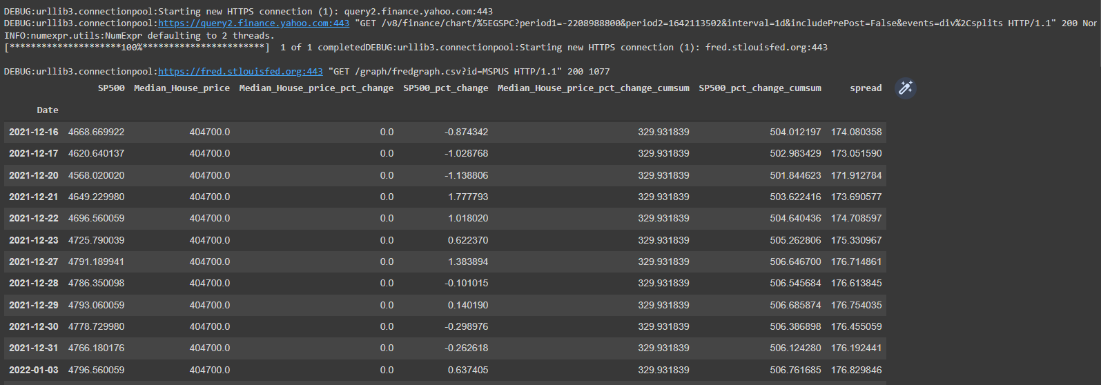
df.tail(20)The Median house price data is quarterly so I’m using ffill to forward fill the data.
What I’m essentially doing next is creating columns in my DataFrame for the following:
- Percent change of asset * 100 to get the return as a percentage.
- Cumultively summing all of the returns to get a percentage of return from a specific date.
- Calculating the rolling spread between the two assets.
My DataFrame now looks like this.
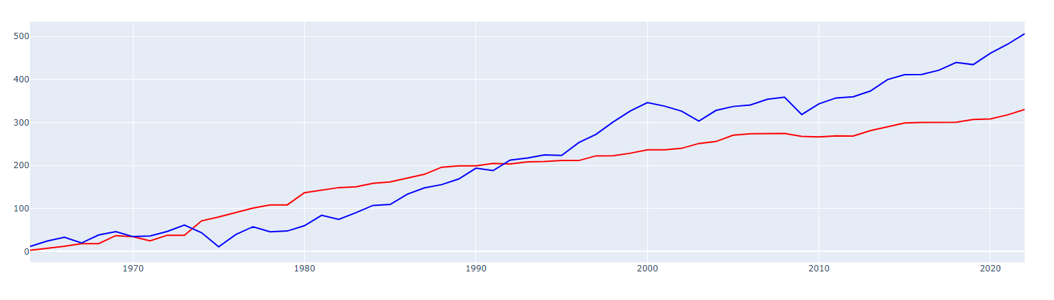
If I plot the cumulative sum I get this.
fig1 = px.line(df, x=df.index, y='Median_House_price_pct_change_cumsum', color_discrete_sequence=['red'])
fig2 = px.line(df, x=df.index, y='SP500_pct_change_cumsum', color_discrete_sequence=['blue'])

fig3 = go.Figure(data=fig1.data + fig2.data)
fig3.show()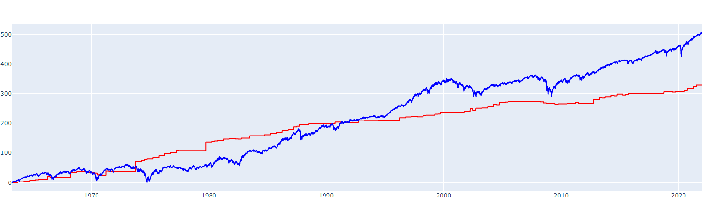
This shows stocks overall since 1963 have outperformed housing.
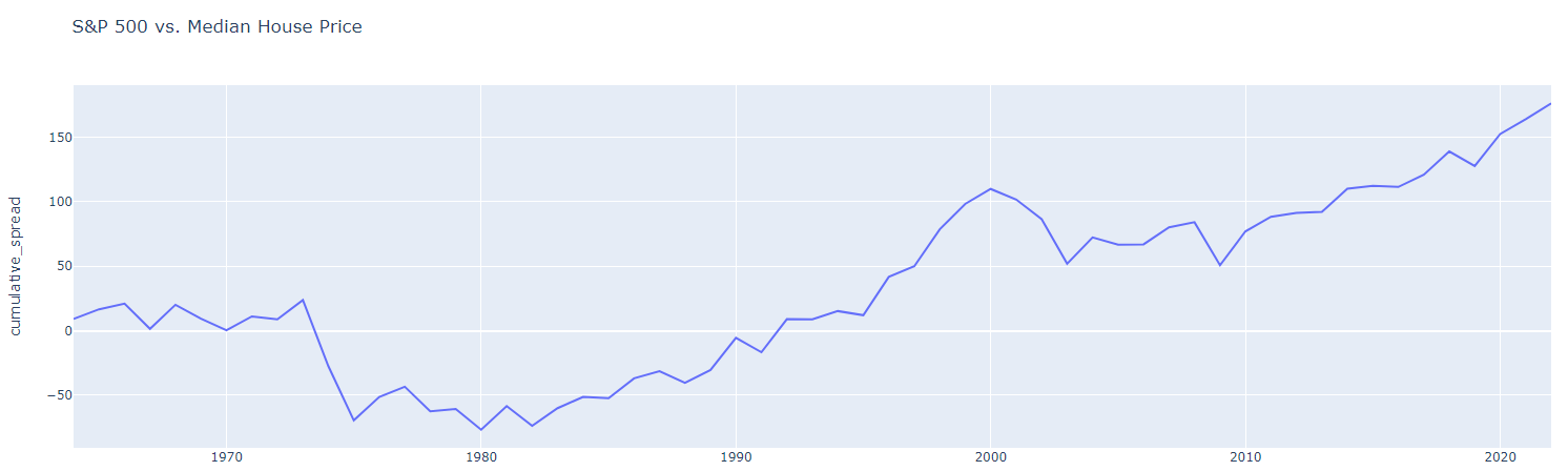
  fig1 = px.line(df, x=df.index, y='spread', color_discrete_sequence=['red'])
  fig1.show()
This code actually plots the spread between the two assets.

Now I’m going to create some more columns in my DataFrame
df_annual=pd.DataFrame()
df_annual['SP500_pct_change'] = df['SP500_pct_change'].resample('1A').sum()
df_annual['Median_House_price_pct_change'] = df['Median_House_price_pct_change'].resample('1A').sum()
df_annual['SP500_pct_change_cumsum'] = df_annual['SP500_pct_change'].cumsum()
df_annual['Median_House_price_pct_change_cumsum'] = df_annual['Median_House_price_pct_change'].cumsum()
df_annual.dropna(inplace=True)
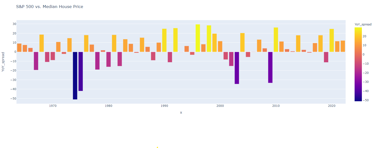
df_annual['YoY_spread'] = df_annual['SP500_pct_change'].sub(df_annual['Median_House_price_pct_change'])
df_annual['cumulative_spread'] = df_annual['SP500_pct_change_cumsum'].sub(df_annual['Median_House_price_pct_change_cumsum'])
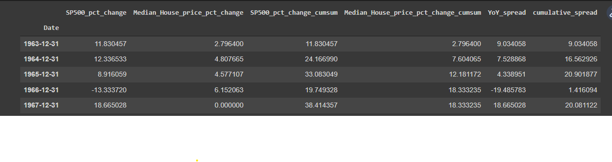
df_annual.drop(df_annual.index[-1],inplace=True)What I’m doing here is resampling my data to annual as it is broken down currently by quarter. The main difference in this code is I’m computing an annual year-over-year return of S&P 500 vs. median house price in the United States. Here is the new DataFrame header.
I’m going to replot this data using the annualized data. Should be almost identical to my first chart.
fig1 = px.line(df_annual, x=df_annual.index, y='Median_House_price_pct_change_cumsum', color_discrete_sequence=['red'])
fig2 = px.line(df_annual, x=df_annual.index, y='SP500_pct_change_cumsum', color_discrete_sequence=['blue'])

fig3 = go.Figure(data=fig1.data + fig2.data)
fig3.show()
And finally, I’m computing the annualized year-over-year spread between S&P 500 and median housing prices. This gives a better idea of the annual returns as opposed to the cumulative returns. Where the bar graph is above 0 indicates the stock market outperformed real estate that year. If the bar is below 0 that indicates the real estate market outperformed the stock market.
And finally the cumulative spread.