Water
You always want to make sure your water is at a pH of 5.8. I calibrated my pH meter and then measured my tap and RO water. You can always then measure these two as a baseline to make sure your meter doesn’t need to be recalibrated.
Tap water pH: 6.1 / RO water pH: 6.6
1.16.21-Tap water pH: 7.3 / RO water pH: 8.2
Here is a list of things you will need to calibrate your water.
2021.1.3 2100
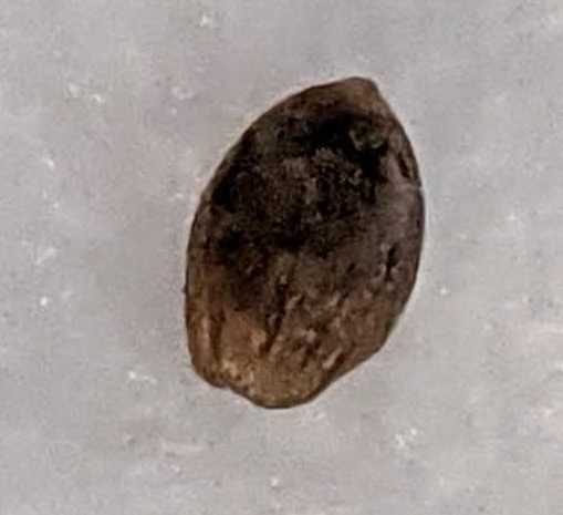
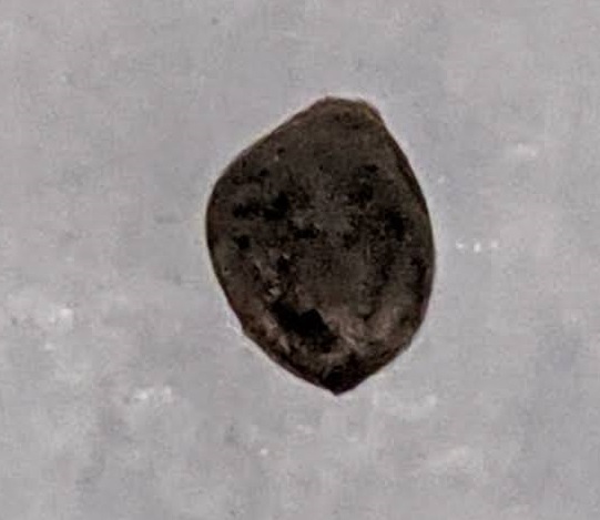
First step is to simply drop your seeds into RO water. I would recommend a max of 5 per cup for 15 hours.
2 green crack seeds in RO water. 4 Jack Herer in RO water.
2021.1.4 1300
Seeds have been soaking for 16 hours moving to napkin in Ziplock, black bag, and box. Placed on Ether Miner for heat.
2021.1.5
Checked the seeds no growth yet.
2021.1.6
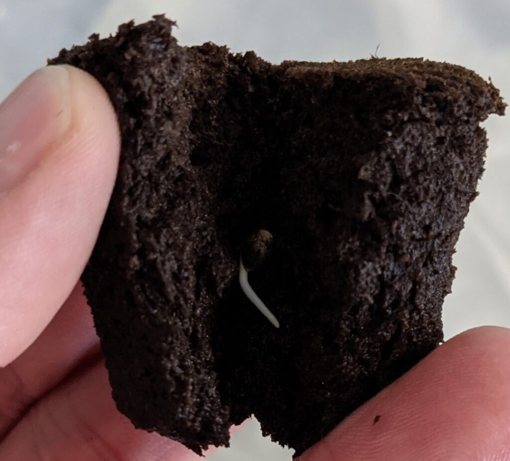
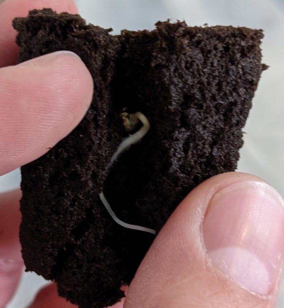
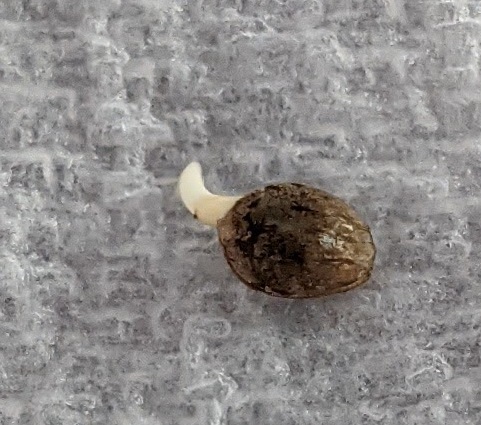
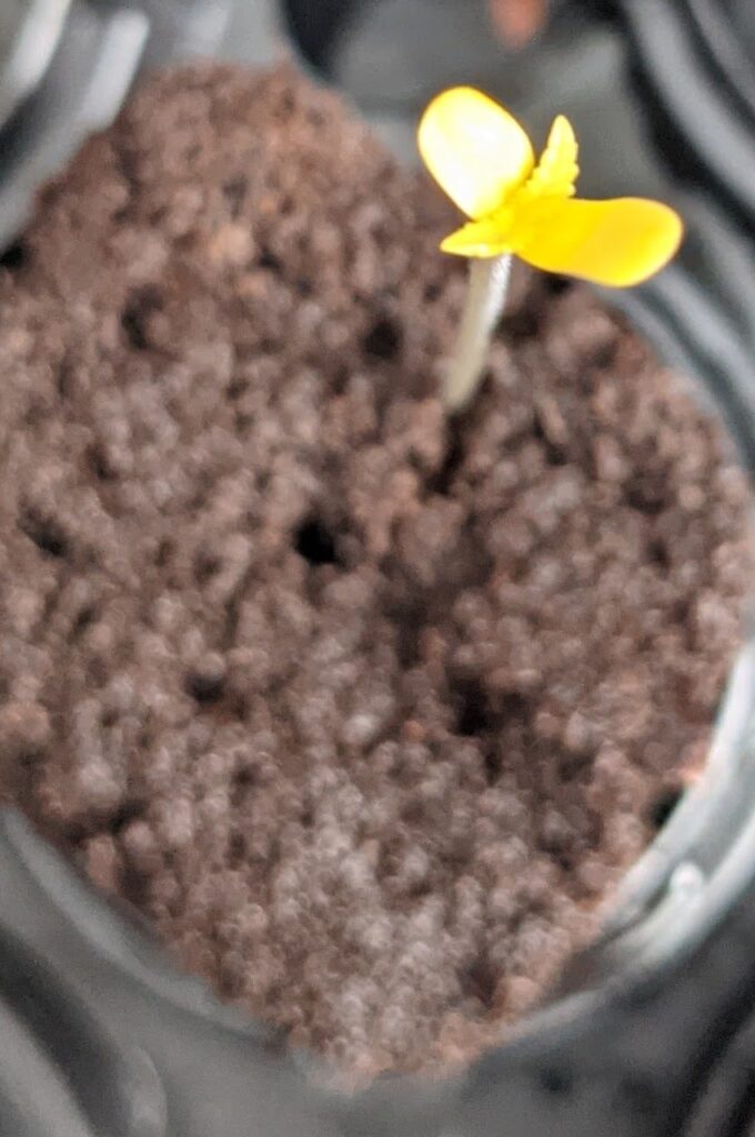
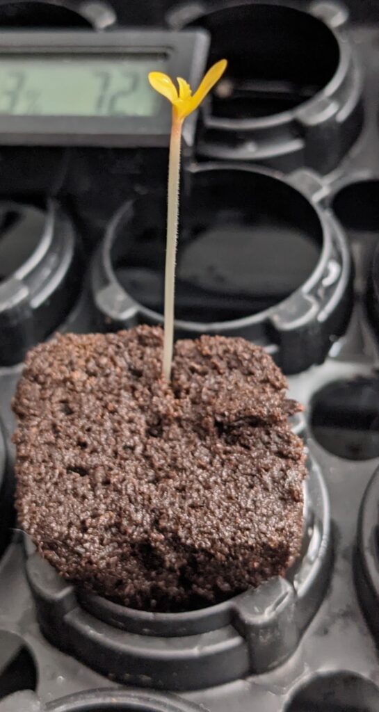
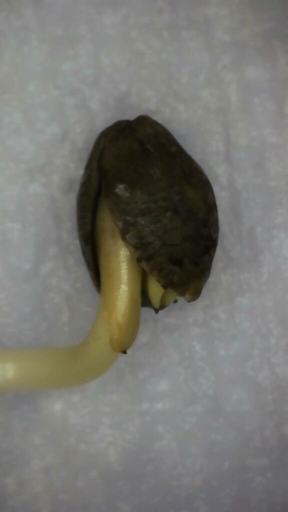
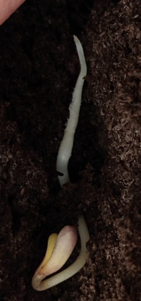
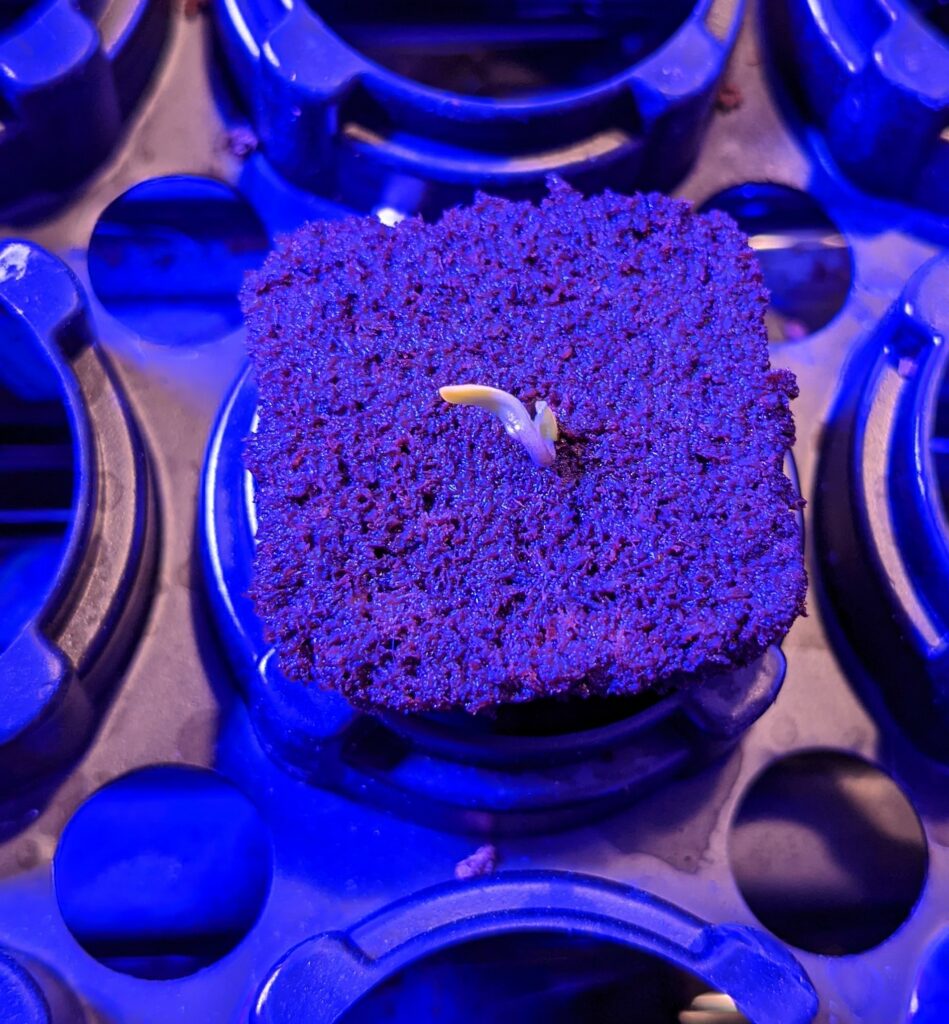
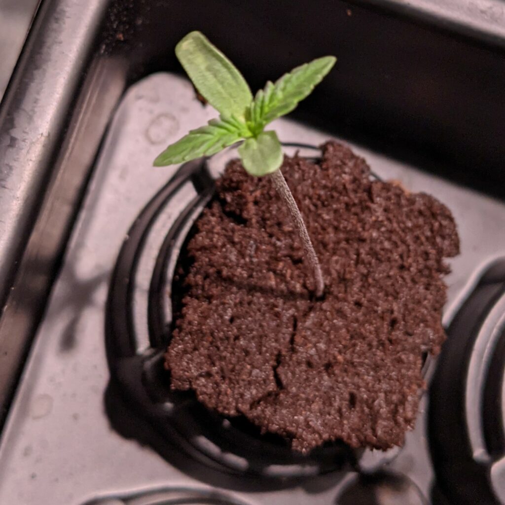
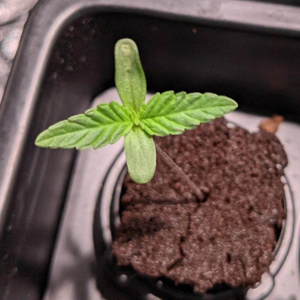
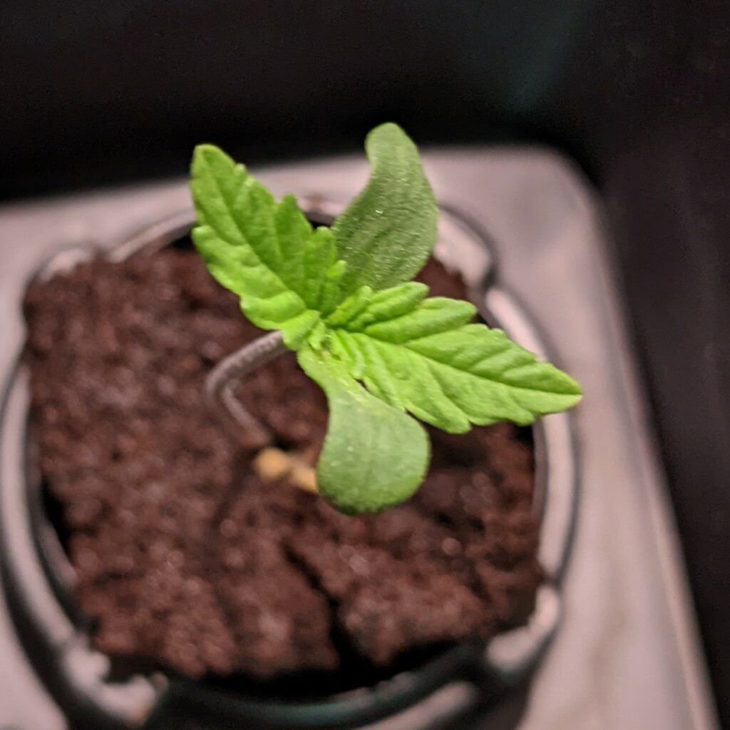
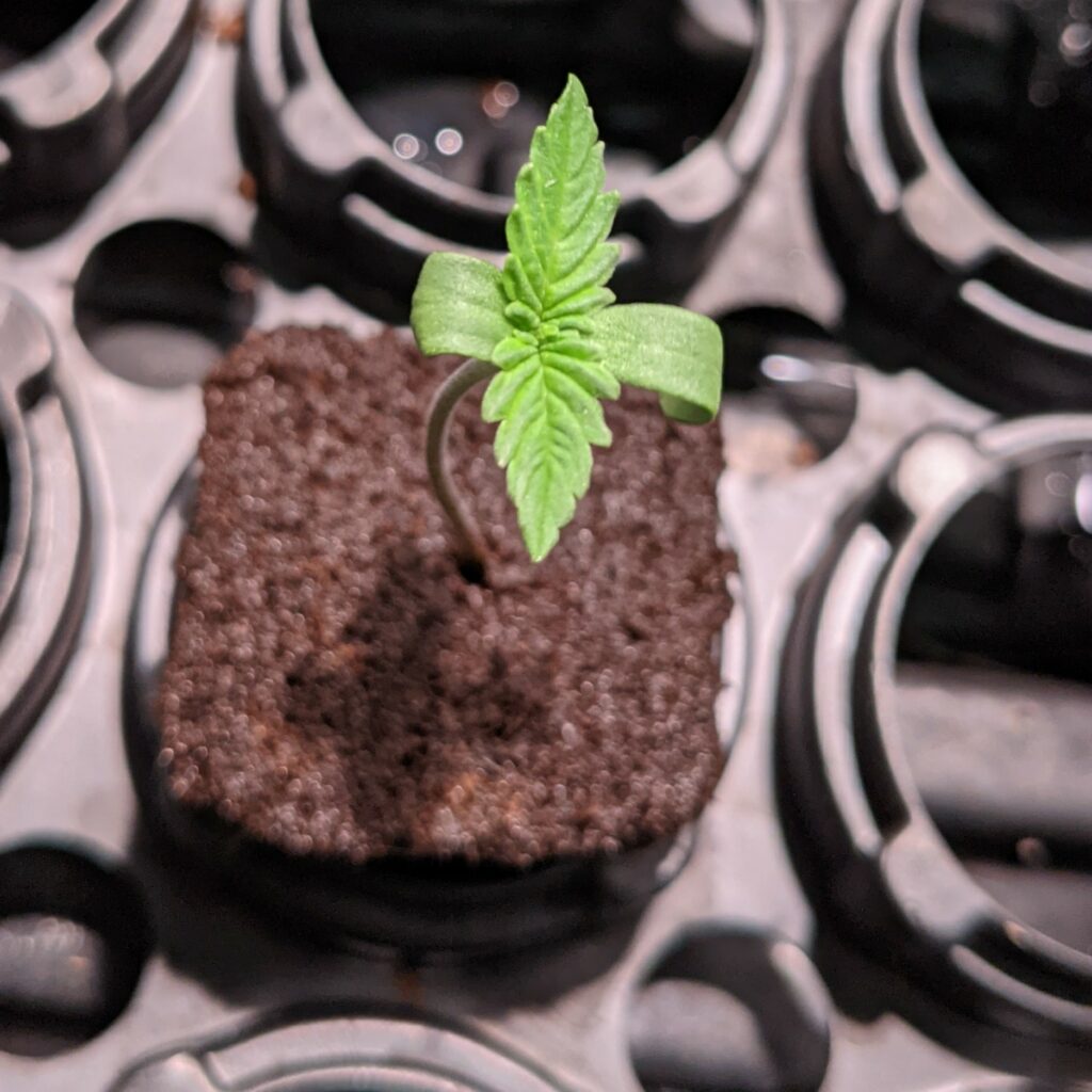
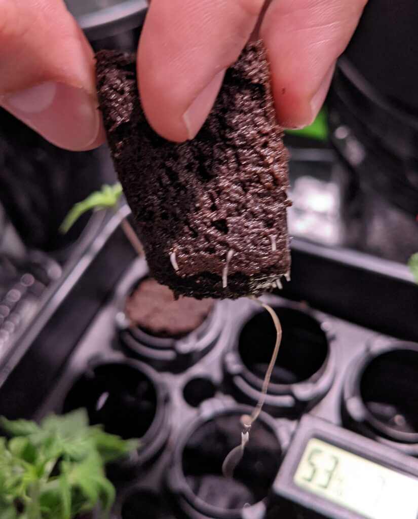
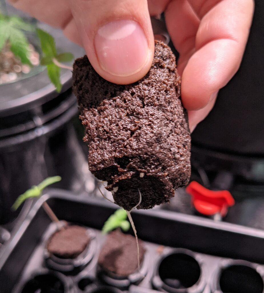
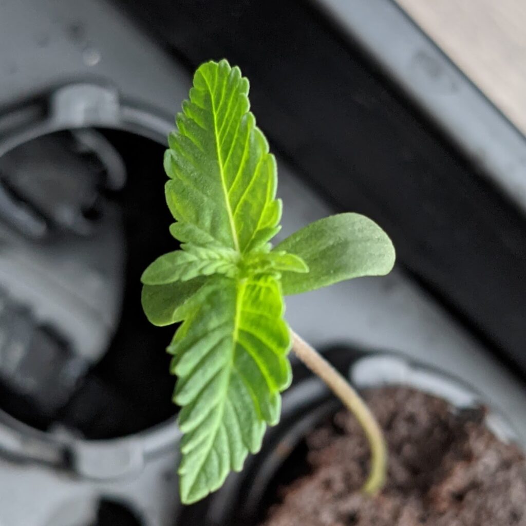
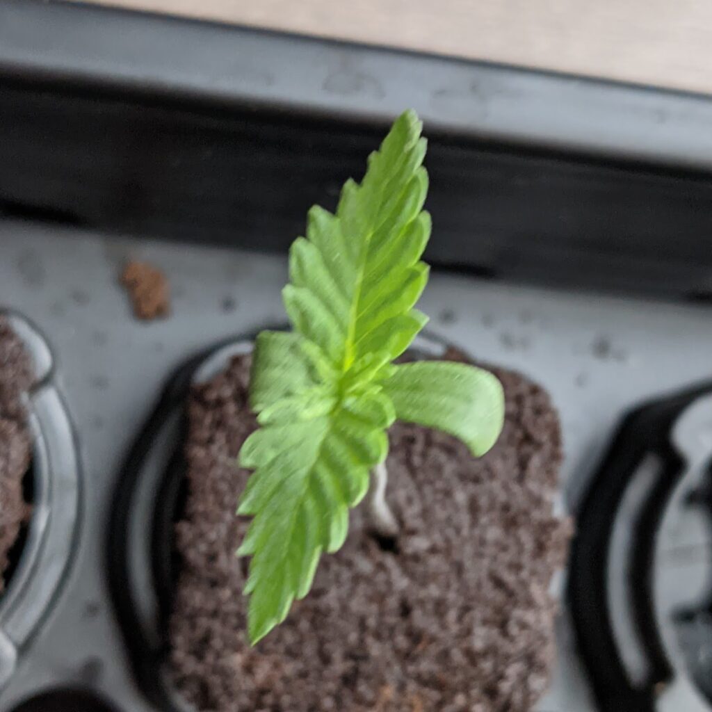
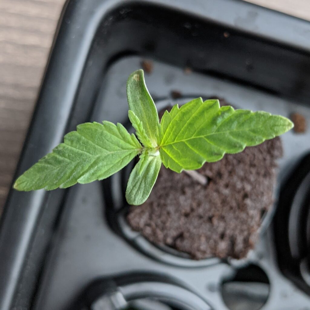
Two green crack seeds have sprouted so I’m going to move these to root riot plugs.
The four Jack Herer seeds have not yet sprouted so I’m going to stick them back in a ziplock covered in a paper towel, black bag, and box.
2021.1.7
Jack Herer seeds still don’t seem to be germinating that quick. I’m going to leave them another day.
Also no sprouting in the humidity dome from the Green Crack plants.
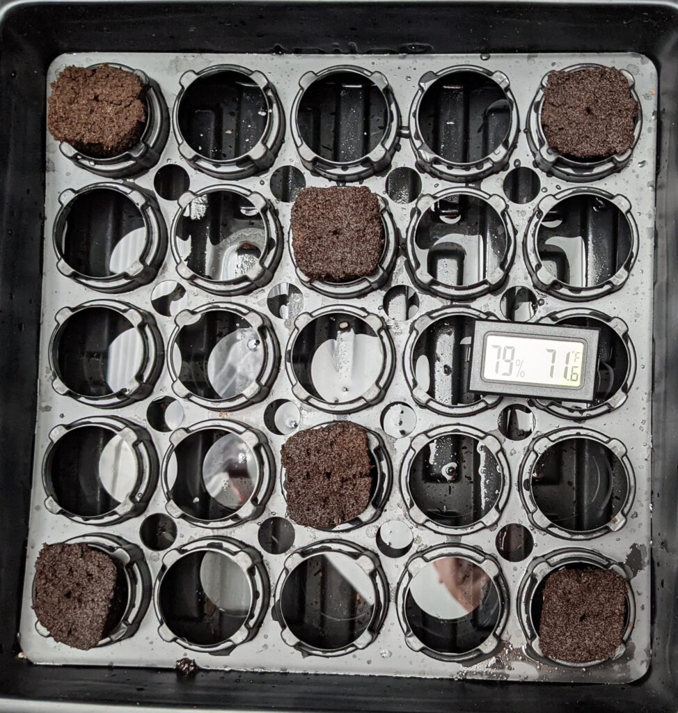
One of the Green Crack plants popped through in the pm.
2021.1.8
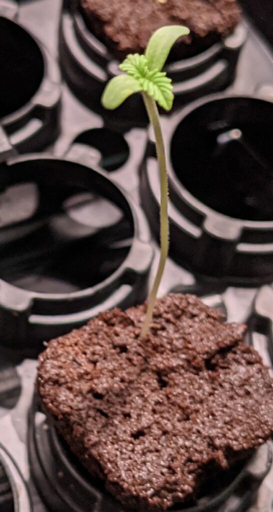
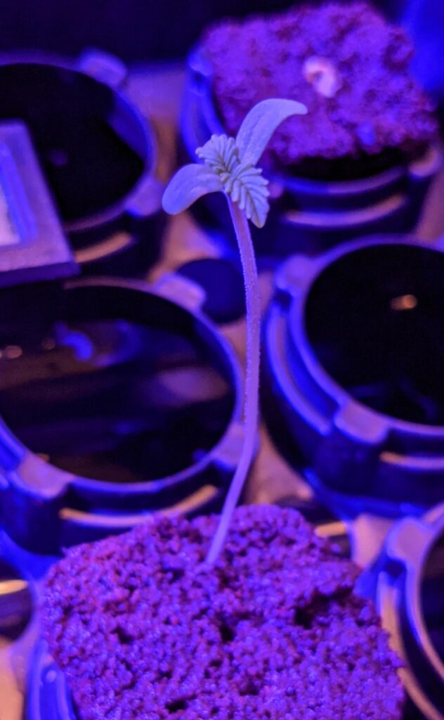
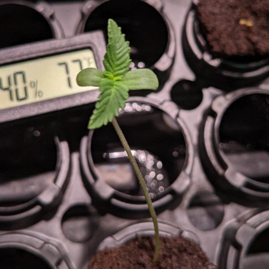
So I probably let this Green Crack plant go for too long in the dark. I’m going to move it into the grow tent where it can get a ton of blue spectrum light. This will promote bushy growth vs. the red spectrum which will cause growth in length and is better for flowering.
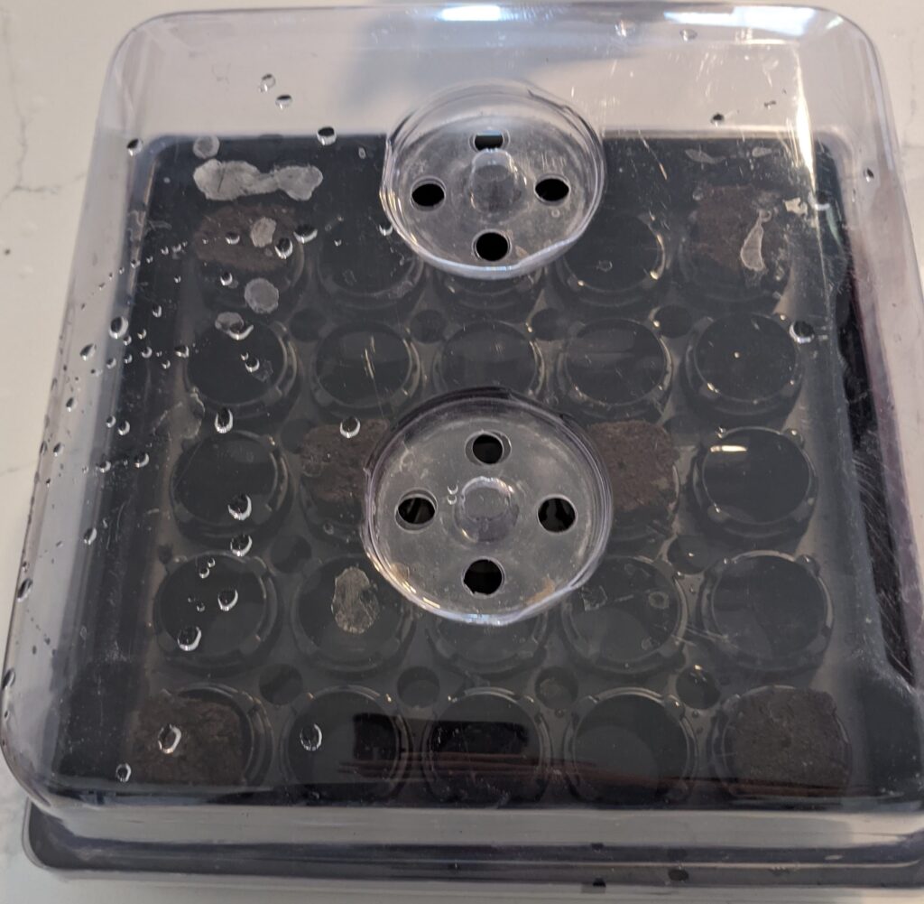
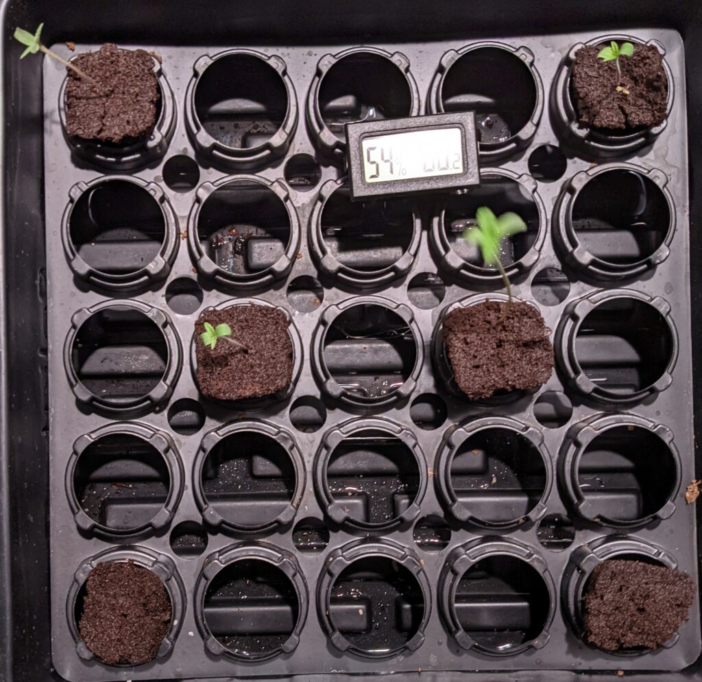
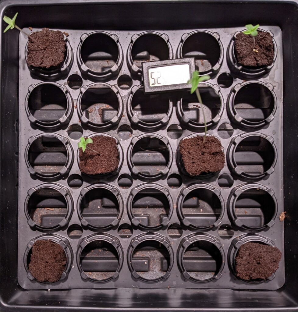
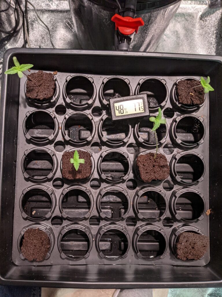
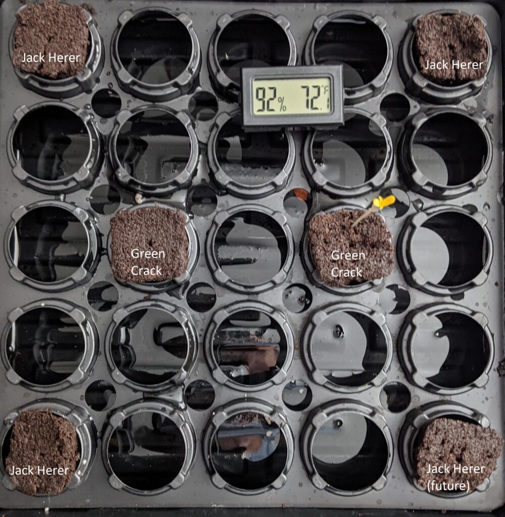
I’m going to move all the Jack Herer seeds to the humidity dome with the exception of one which doesn’t appear to have popped open. One of them appears to have broke when I moved it. I feel like I may have left my paper towel too wet.
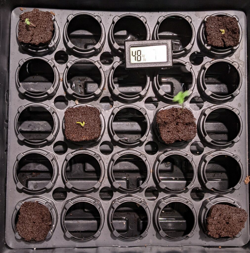
Here is the placement of the seeds in the humidity dome.
Humidity
You’re going to want a humid environment for your plants. I would recommend something like this.
2021.1.9
Lights
Any of these smaller lights will work for the seedling phase.
Powerful LED’s
You are eventually going to need something more powerful. This is what I use.
2021.1.10
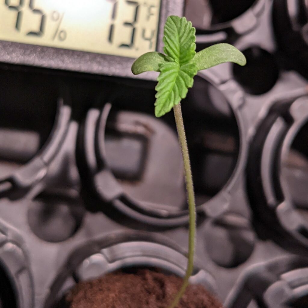
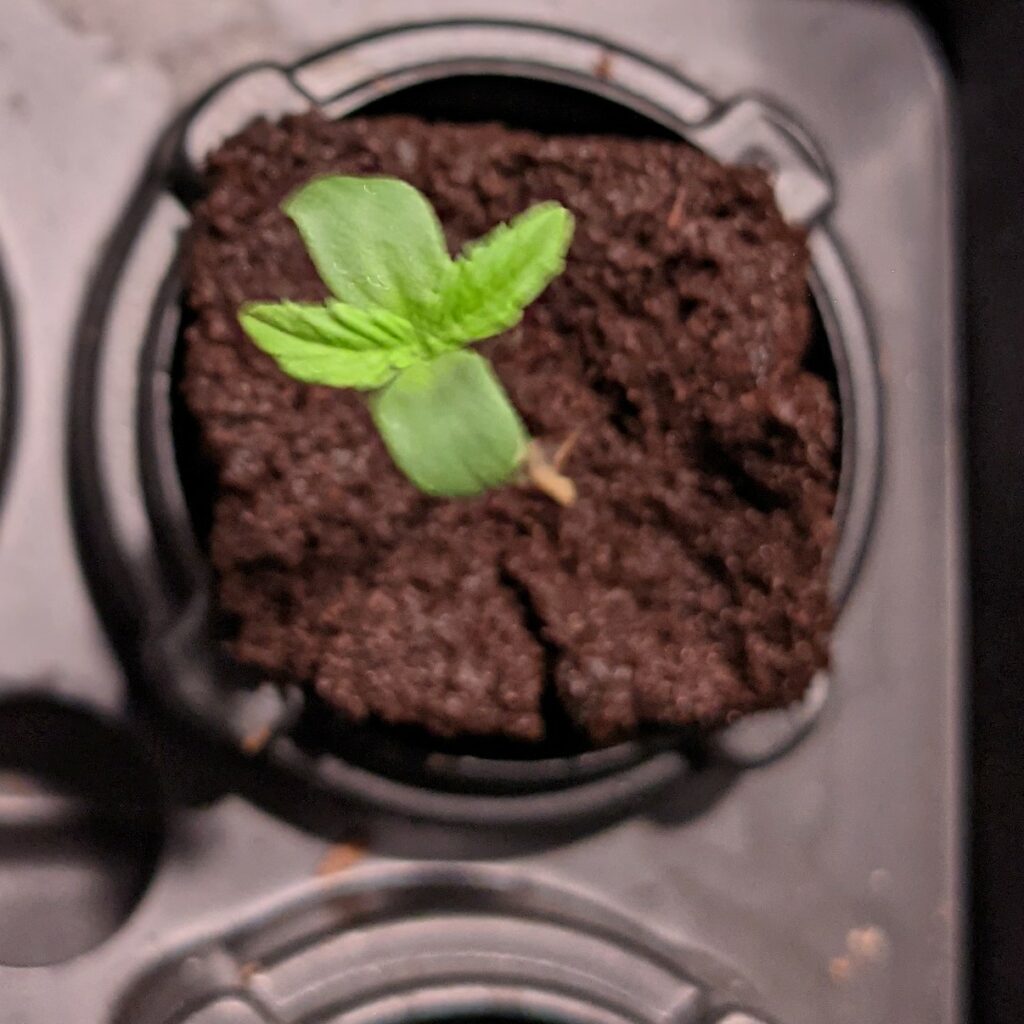
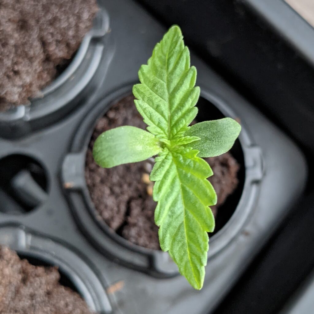
Looks like all of the seedlings popped except one. Haven’t added any water since the original move from the plastic bag. Also the last Jack Herer seed is refusing to germinate. I left it in the bag but typically when it takes this long they’re duds.
2021.1.11
2021.1.12
Pretty sure that bottom left Jack Herer is shot. Plus the last seed doesn’t appear to be germinating.
2021.1.14
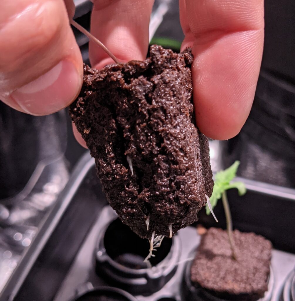
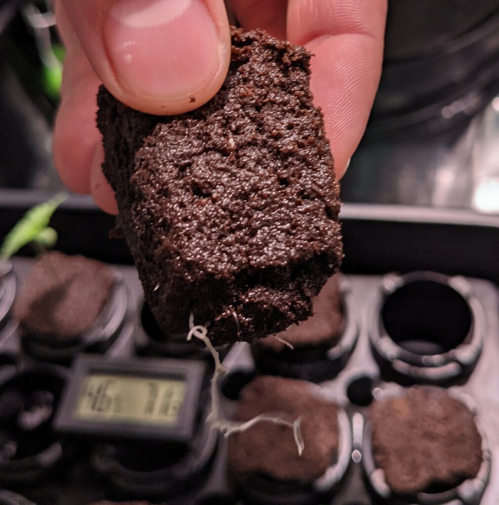
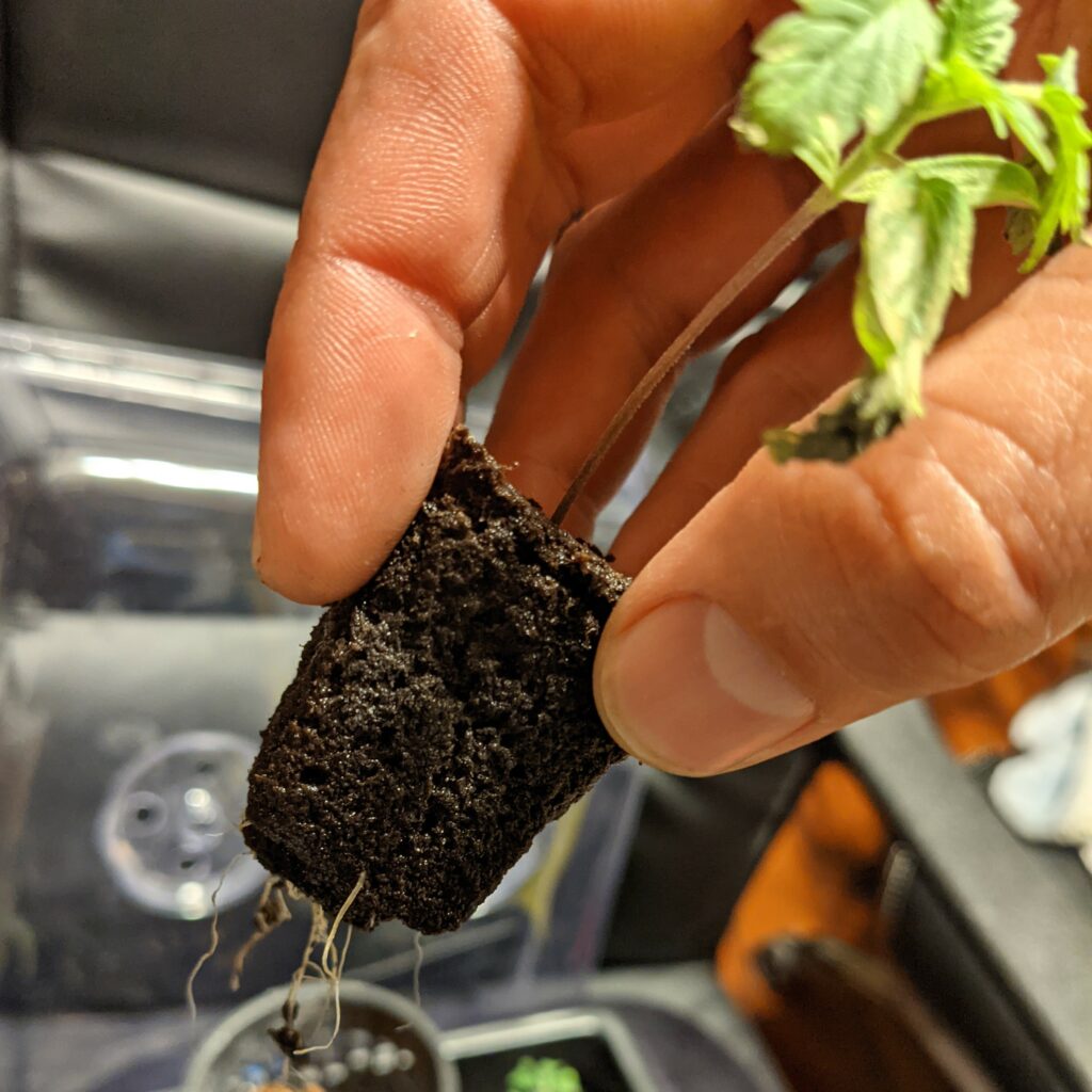
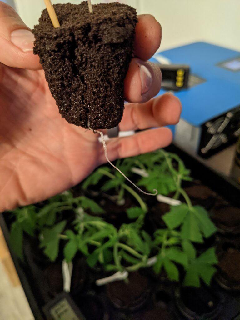
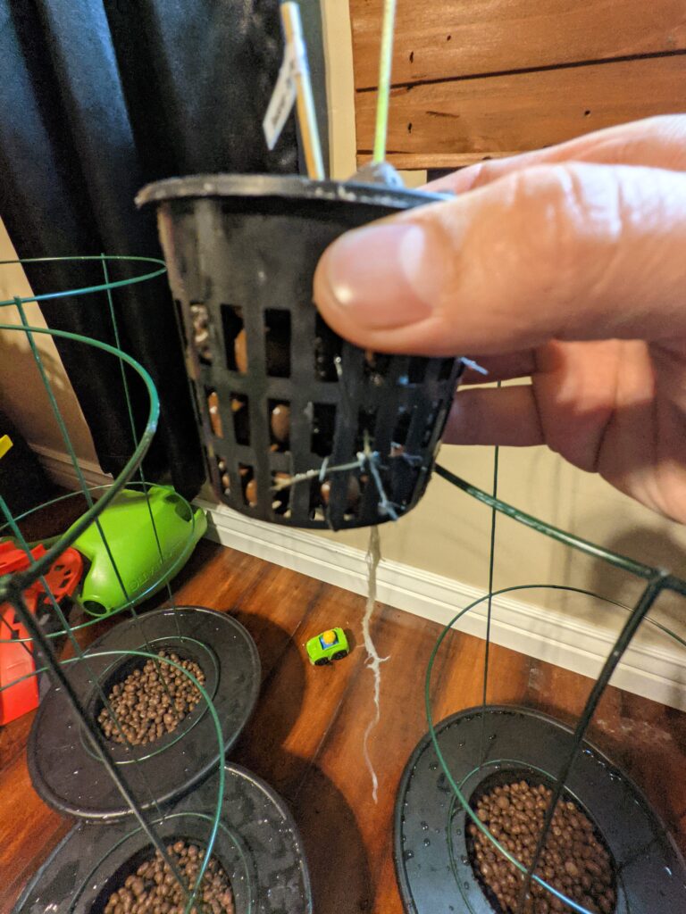
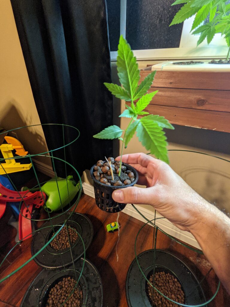
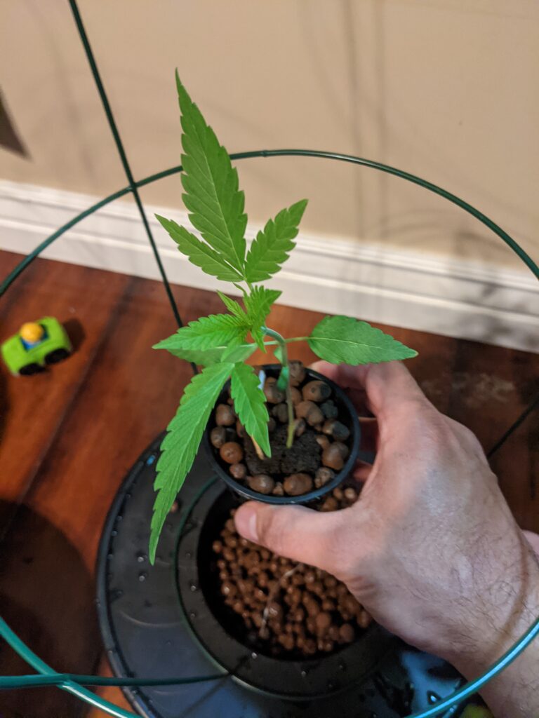
Looks like roots are starting to appear. I’ll probably move these to a hydroponic setup soon.
First nutrients
Now that these seedlings are getting a little older I’m going to add some Clonex nutrients. I’m going to mix up 1 gallon of water and 18mL of Clonex.

1.21.2021
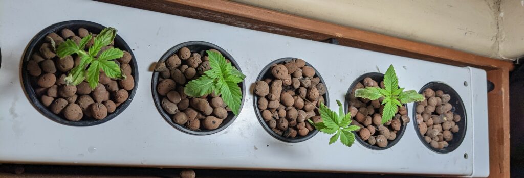
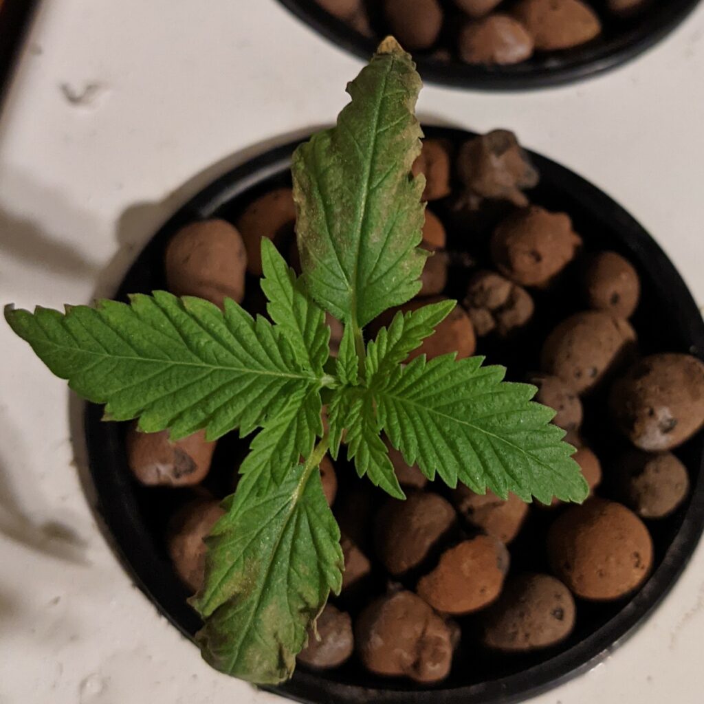
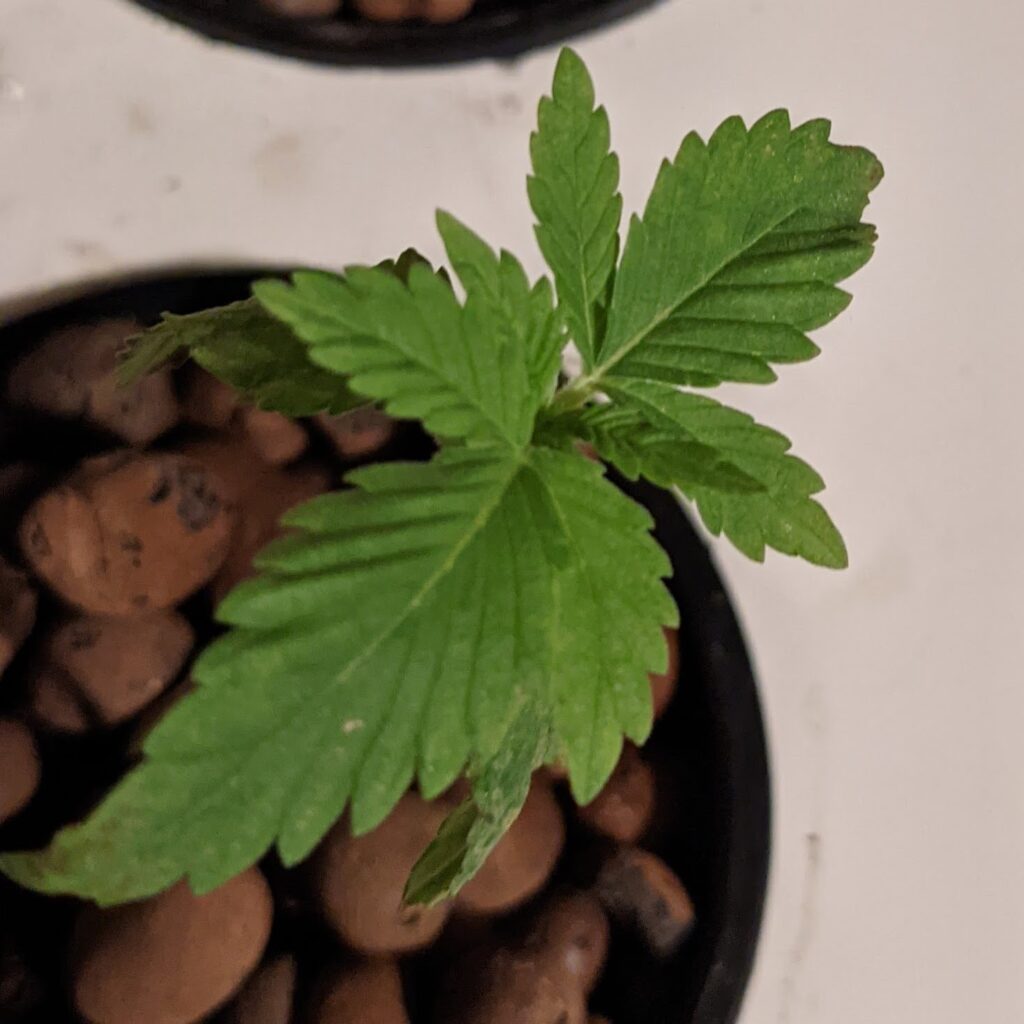
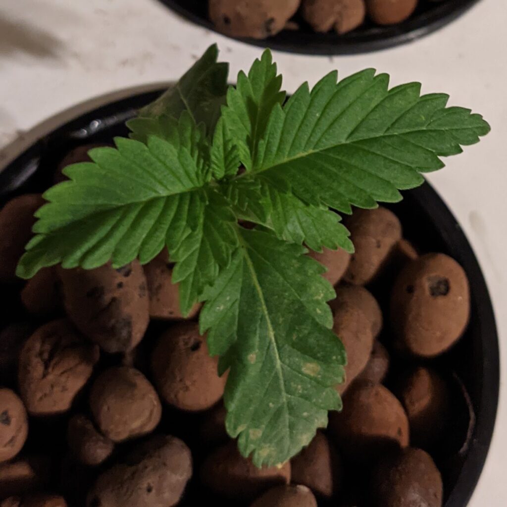
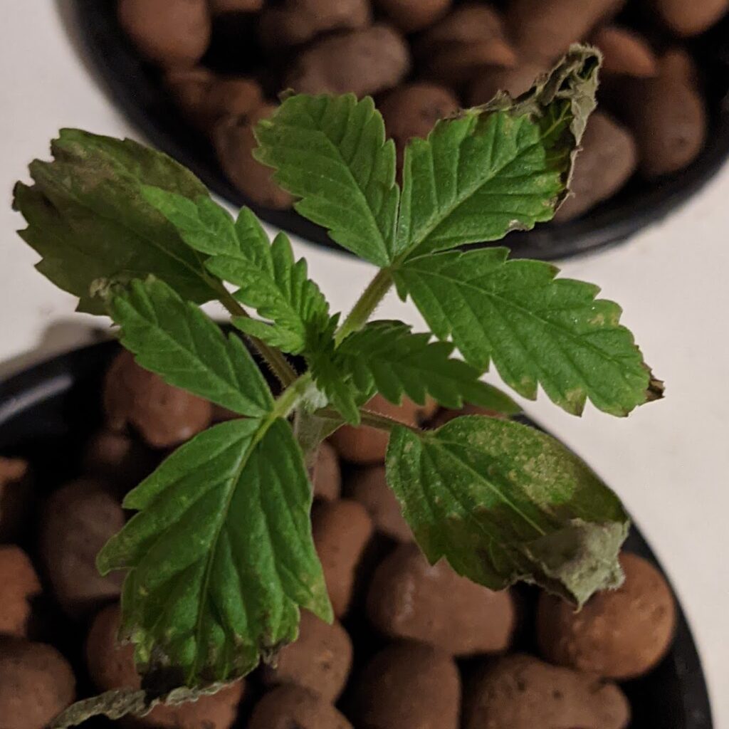
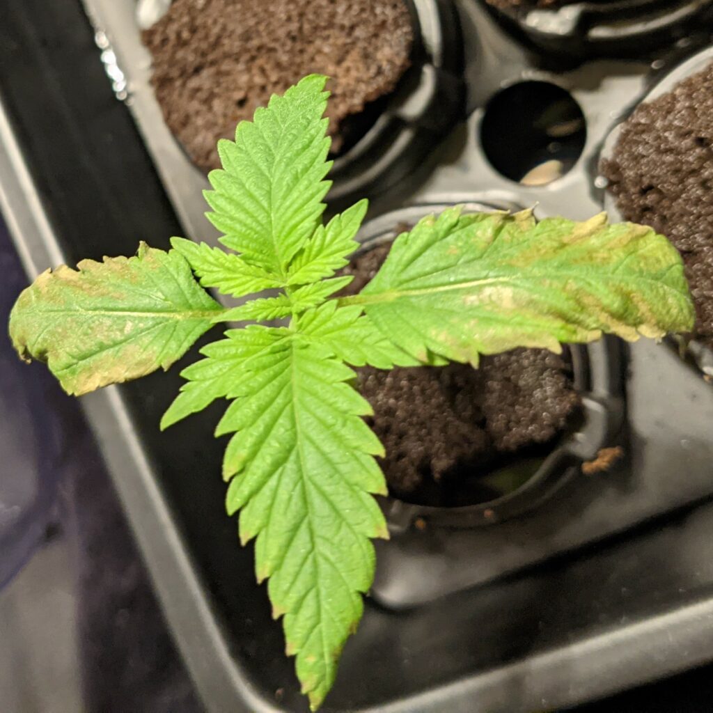
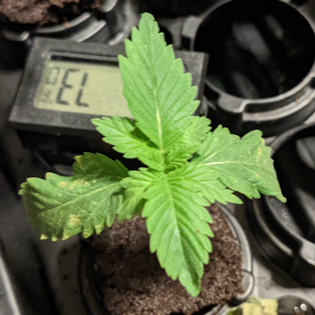
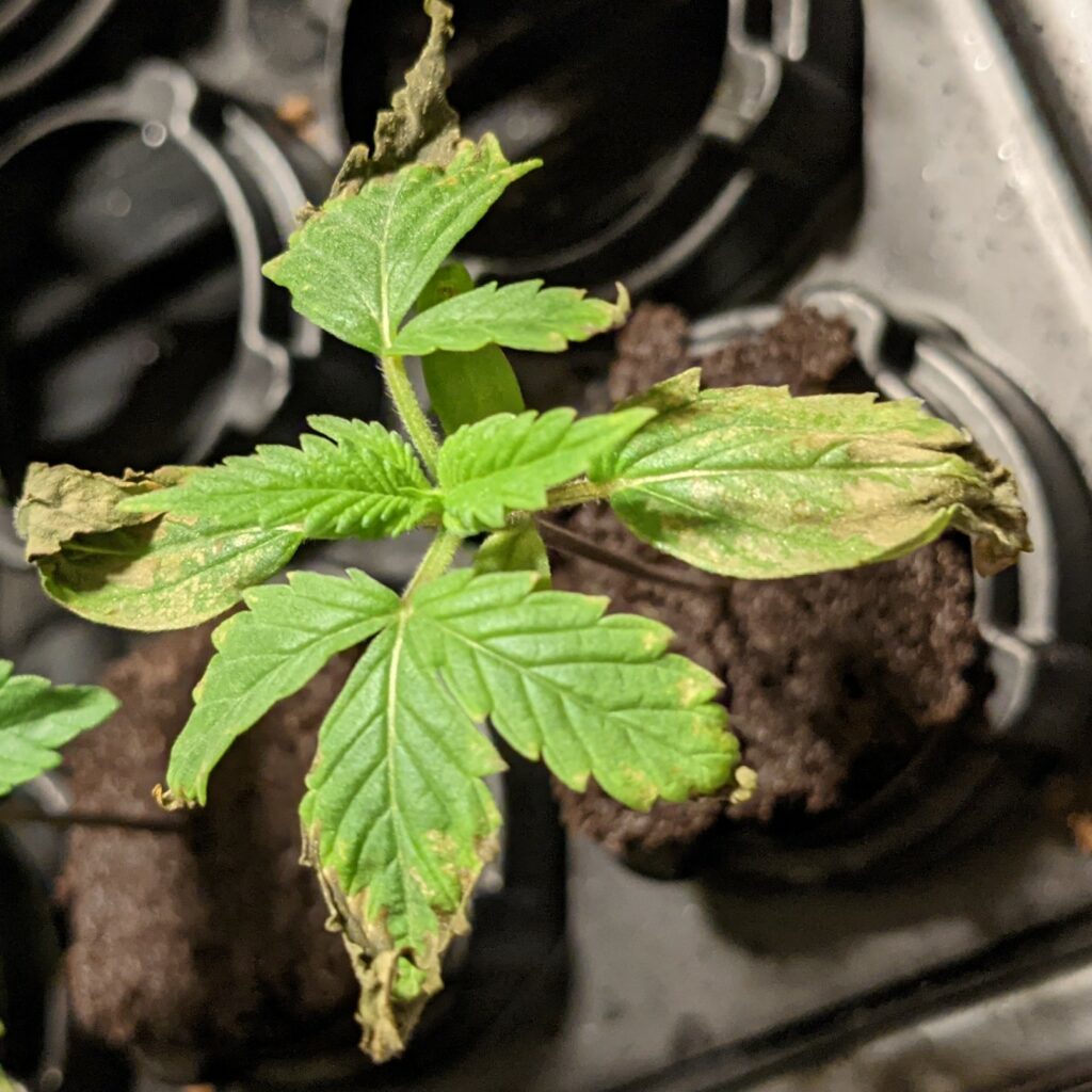
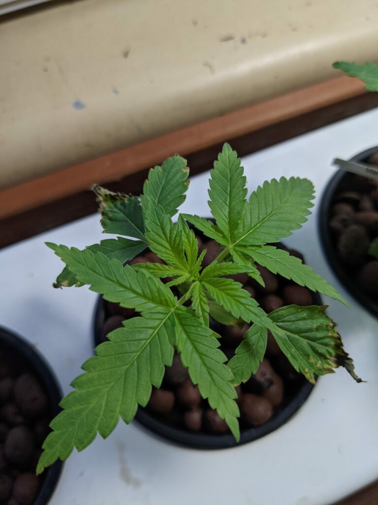
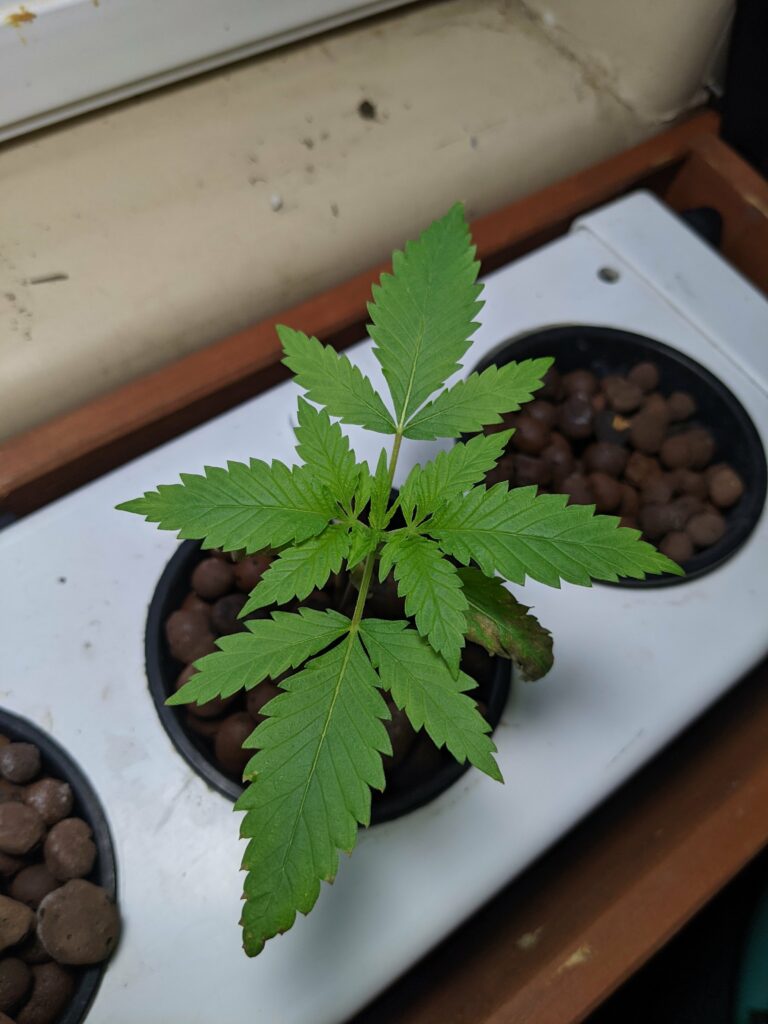
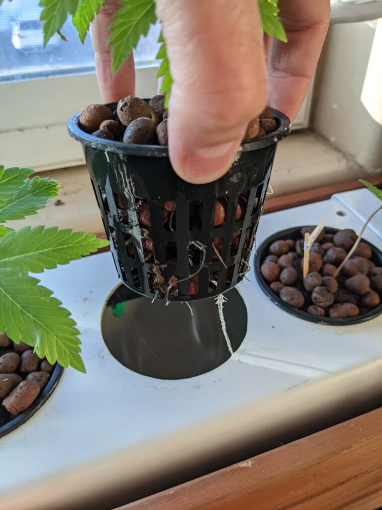
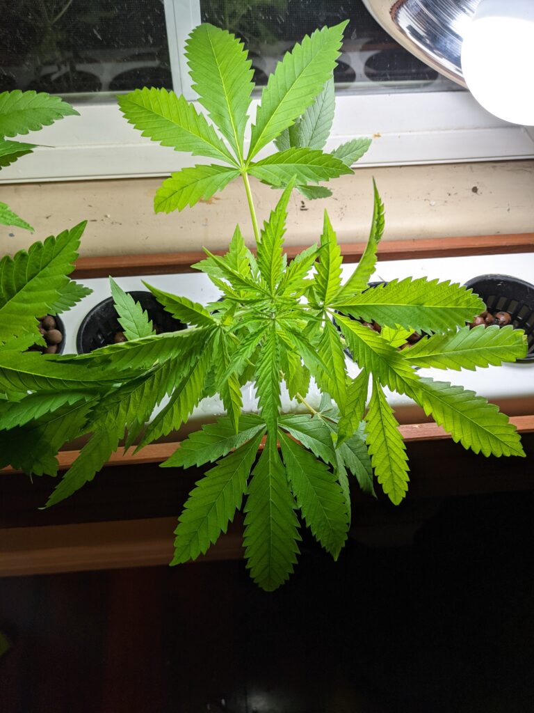
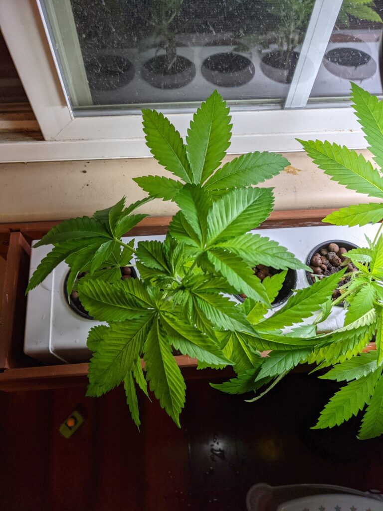
So I definitely got lazy and waited too long to move these into my hydroponic box in my window seal. You can see some of the leaves are in bad shape.
I’m going to put these in my south facing window seal for light. I’m going to supplement it with a florescent light 18 hours on and 6 hours off.
Water and Nutrients
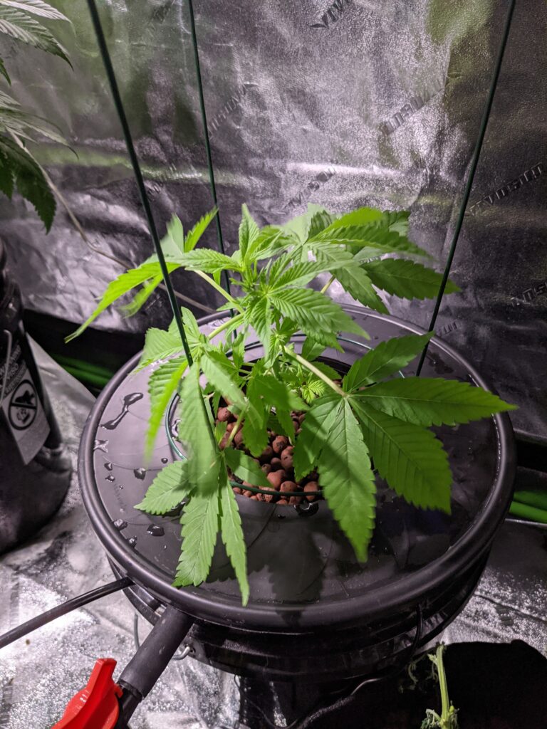
Here is my template for maintaing the hydroponic system. This one is just a single 5 gallon bucket that pumps the water onto the roots and it drains back down.

The main nutrients I use are made by General Hydroponics.
I also use a few additives in addition to these.
h2o2 also known as hydrogen peroxide. In hydroponic setups you’re apt to get some type of root rot or infection. I use h2o2 as a preventative along with Armor Si made by General Hydroponics.
You’ll want to use RO water with your setup. This way your water is pure. With that being said it’s important to add calcium and magnesium back into the water.
Flushing your water
Every 7-14 days you’ll want to completely drain and flush your water. What I’ll typically do is drain all the water. Replace it with tap water and this FloraKleen product. Let this run for 2-4 hours and then completely drain it.
1.27.2021
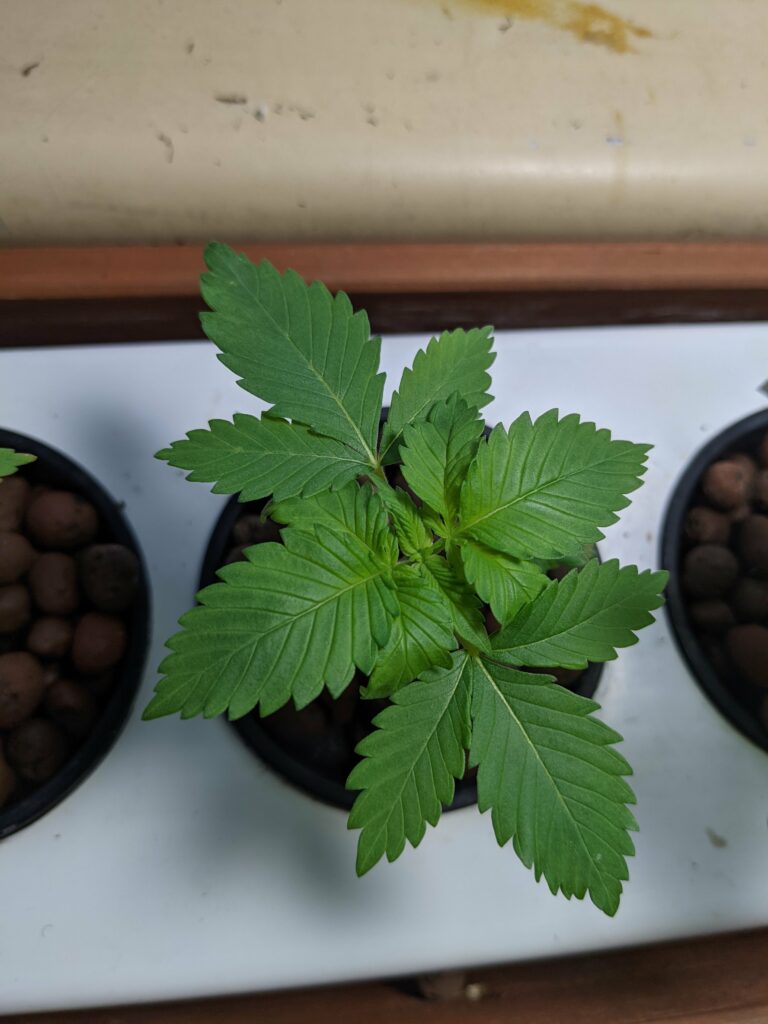
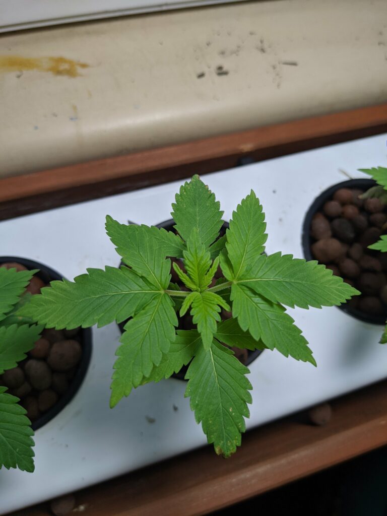
I haven’t done anything to the plants. I just let them grow with 18 hours of LED light and then the natural sunlight through the window.
1.29.2021
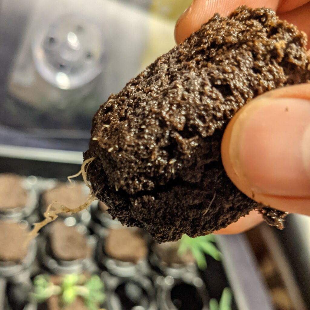
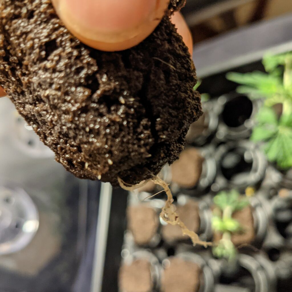
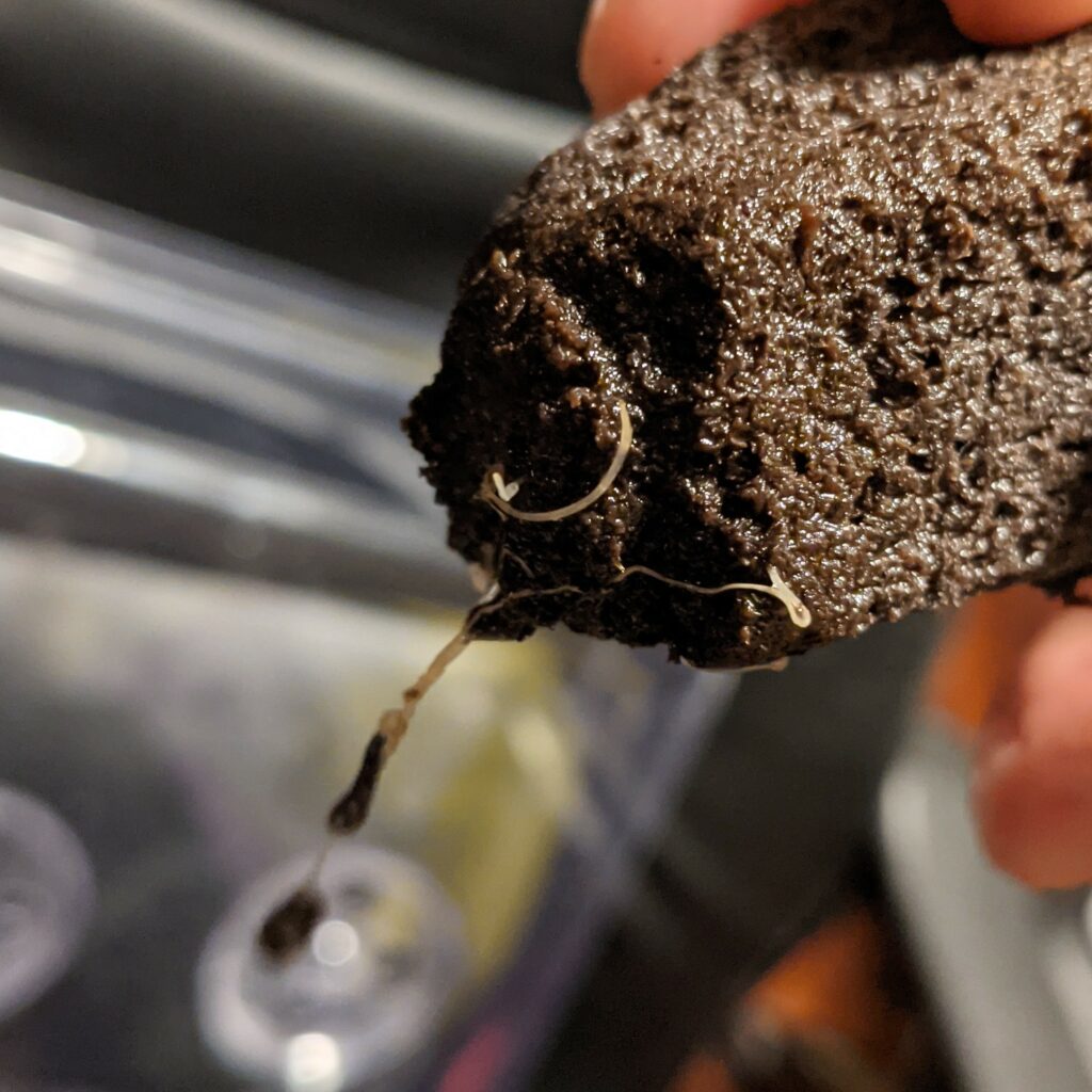
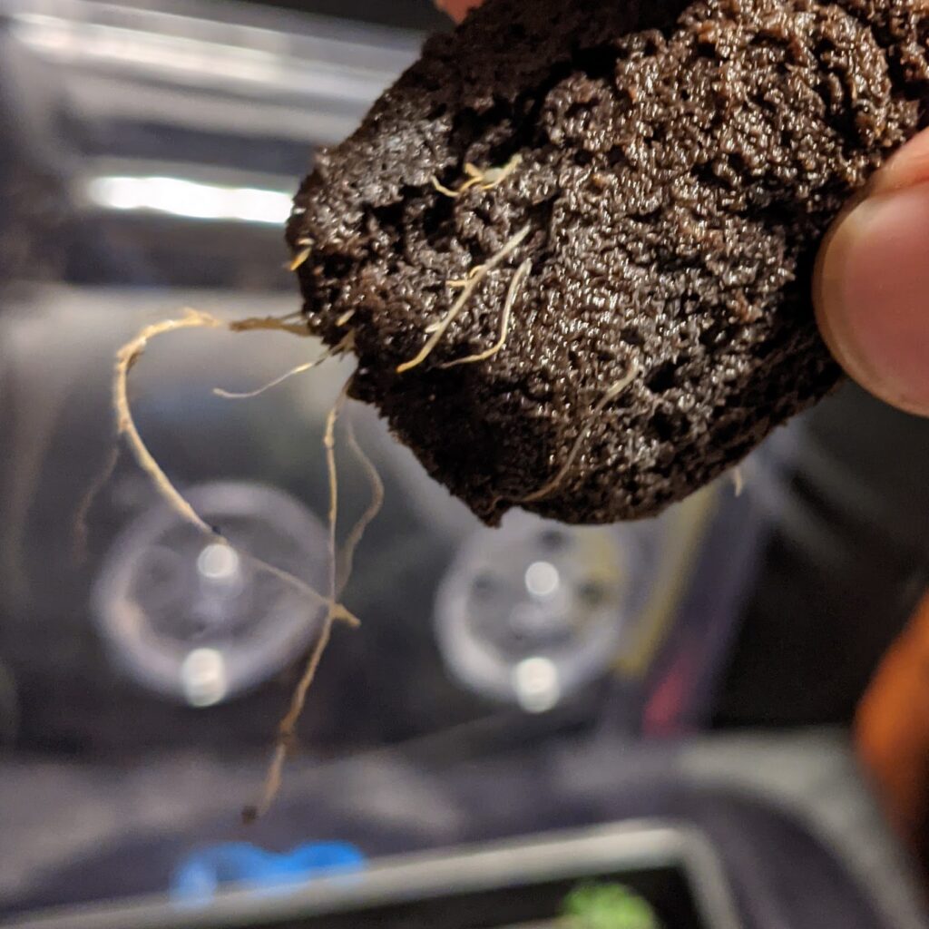
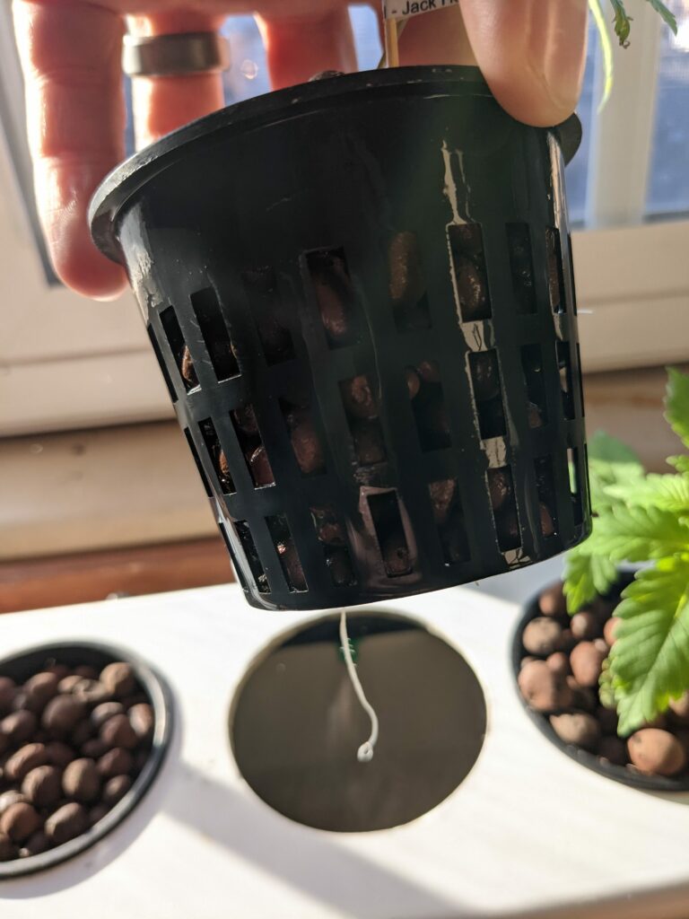
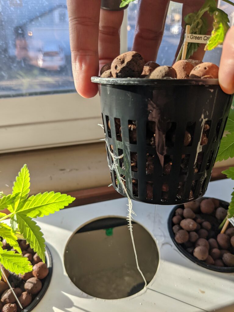
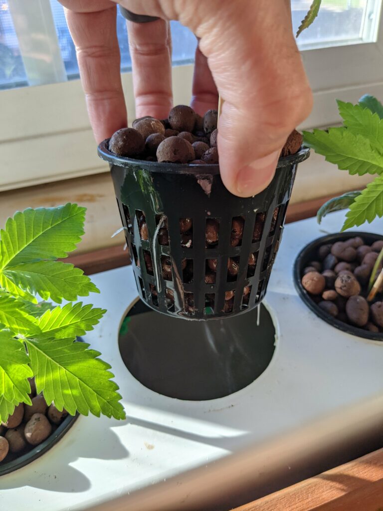
I wanted to post an update of what the roots look like at this point.
I also lost one of the plants and only had 4 growing. So I decided to germinate two more today. A Harlequin and a Blueberry plant. I tried twice to get a Harlequin to germinate and failed both times. So I’m just going to move this Blueberry over to the window seal hydroponic setup.
2.1.2021
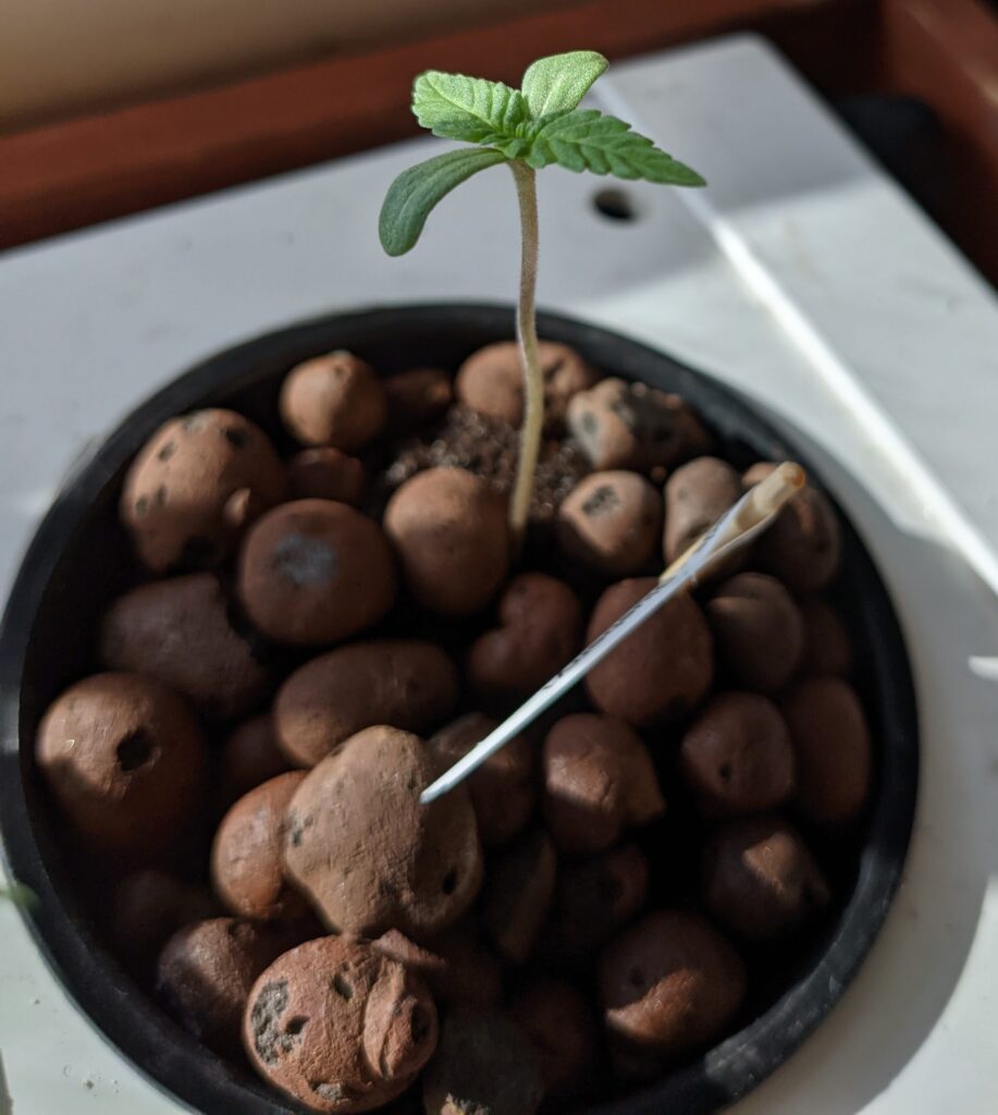
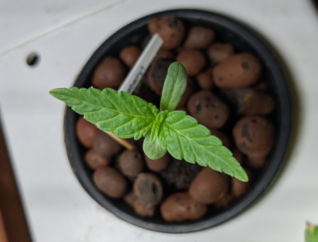
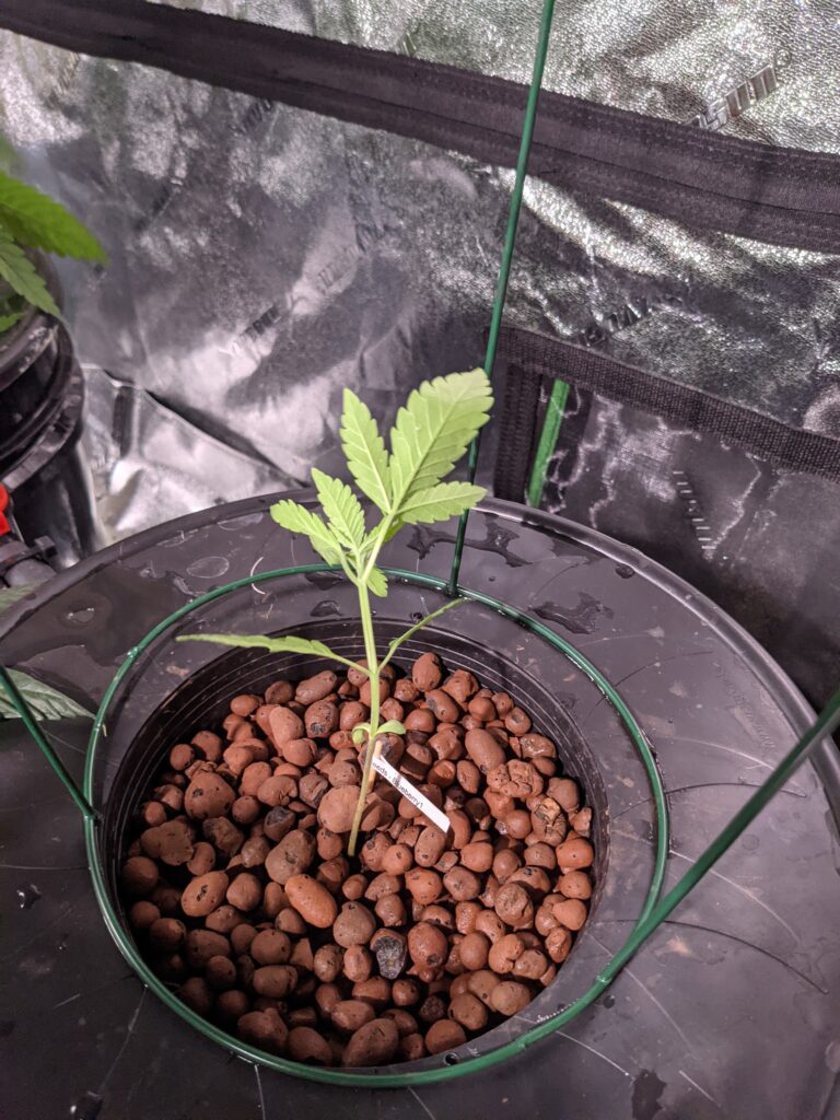
The Blueberry is looking healthy after a few days.
2.11.2021
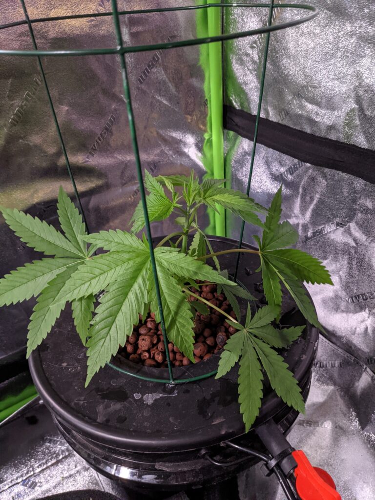
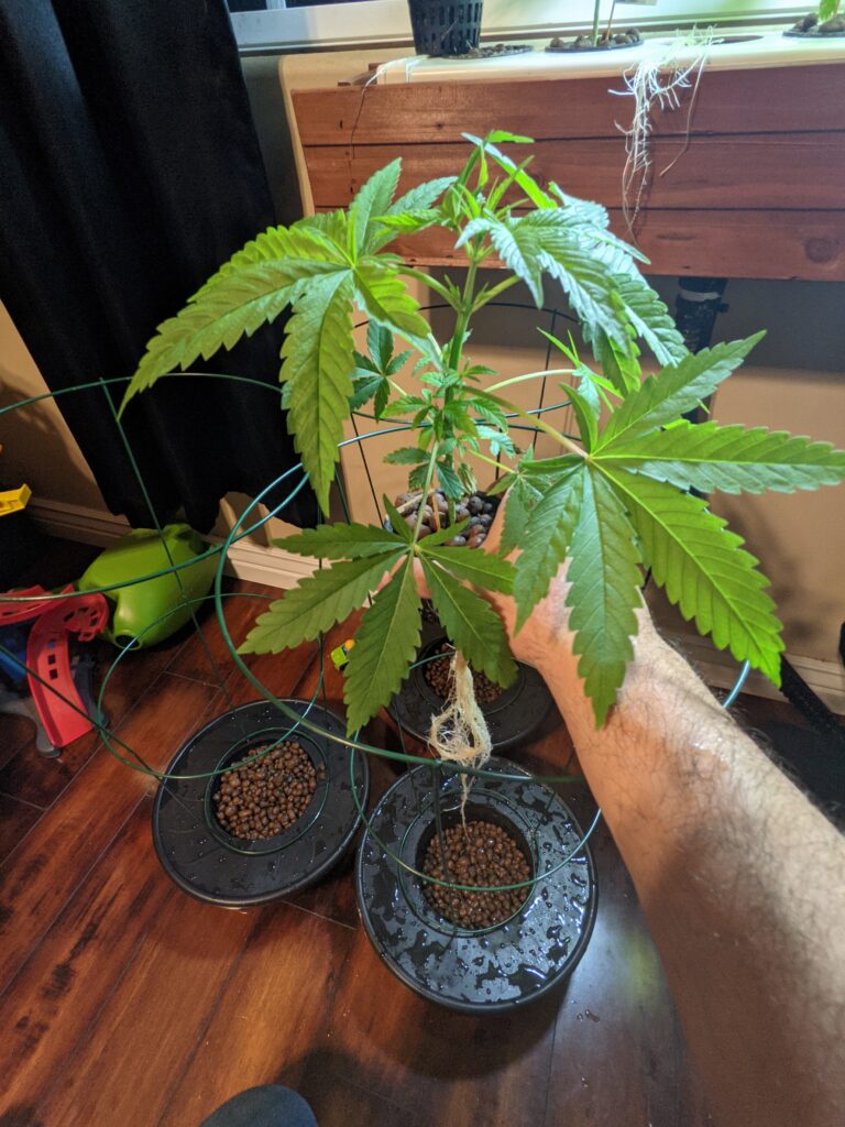
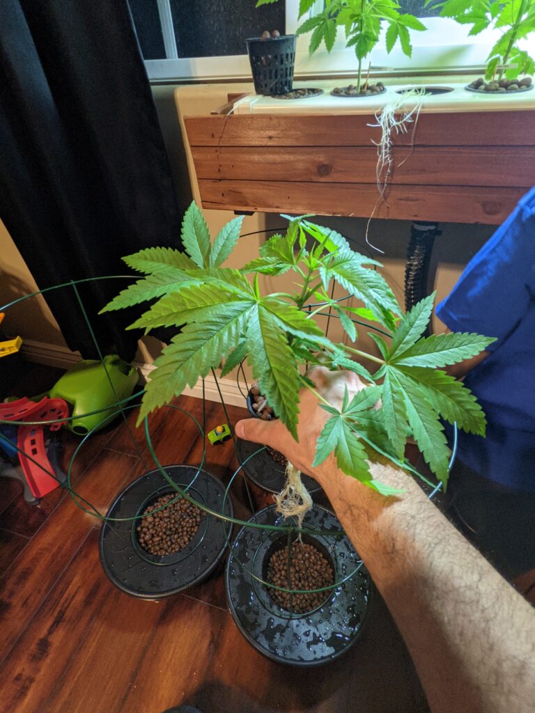
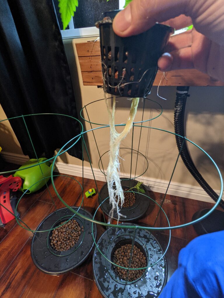
So I neglected these plants again. I haven’t added any nutrients since the initial move on 1.23.2021. It gives you an idea of how maintenance-free this setup is. You can also see a large amount of growth in a relatively short timeframe. The roots grew way too big to pull through the plastic containers so I lost a good portion of them while transplanting tonight. It will be interesting to see how they respond. You can see how they’re in their final spot which is the 5-gallon bucket until they flower and harvest. I had to leave two of them in the window seal due to a lack of room in the tent. Their roots are going to get way too big for this setup. I may let them flower early or move them to a dirt container.
Notice the Blueberry is the smallest one and is about 10 days old.
Tent
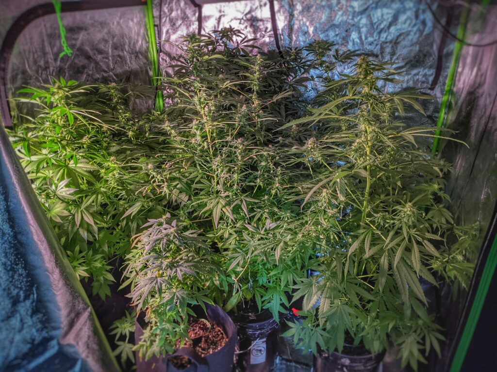
The plants are now in this tent.
Lighting
The LED light I’m using is this.
Exhaust Fan
You’ll also want a fan to keep the airflow and vent the plants. I use this one.
Timer
I use these timers to control the lights.
Humidity
You’ll also need a humidifier to keep your air humid.
The method I use are 5-gallon buckets in which one bucket is the control bucket. It’s empty and they all drain back into it. Then the water gets re-circulated using a pump to spray the roots.
2.25.2021
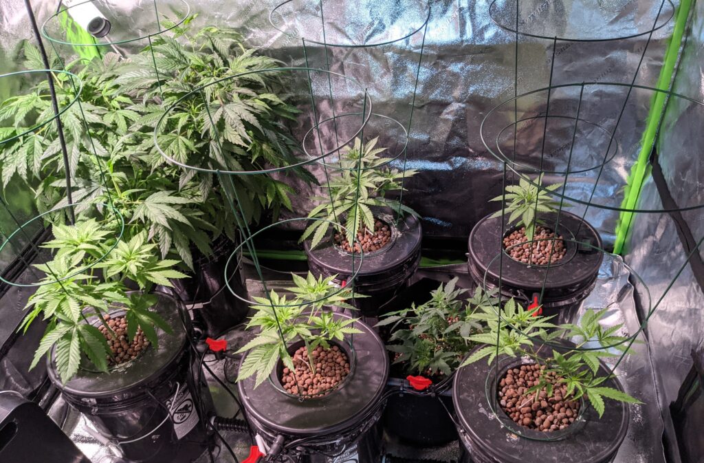
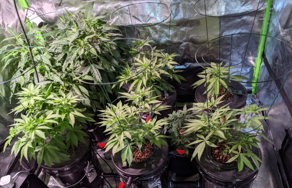
Here are the plants in their final home. In Arizona, you can grow up to 12 plants per household so long as there are two adults in the household.
3.5.2021
Updated status.
3.12.2021
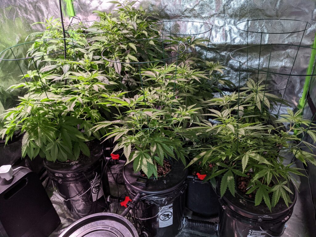
Updated status.
3.17.2021
Lighting Schedule change
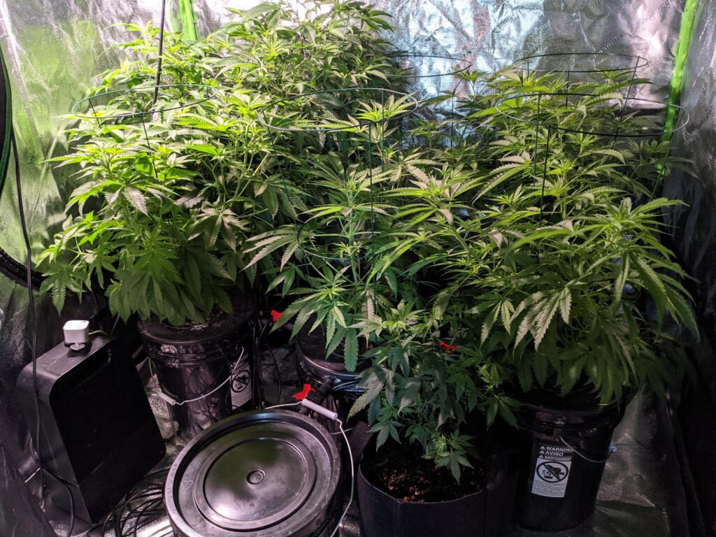
Today I’m switching the lights to be on 12 hours and off 12 hours. What this does is it signals to the plant it’s time to flower, or create buds. This will be the final phase of my grow in about 6-8 weeks the bud will be ready to harvest.
3.22.2021
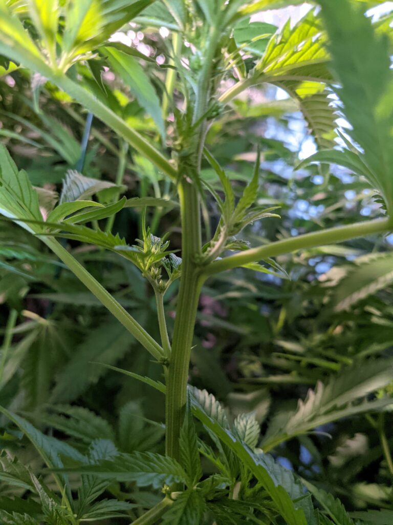
I wanted to show what a male plant looks like. I had to take this one out of the grow tent. You don’t want males as they will pollinate the females and ruin the crop.
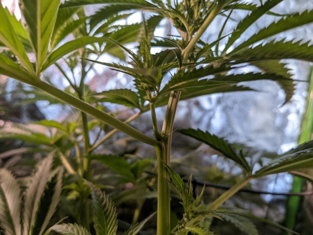
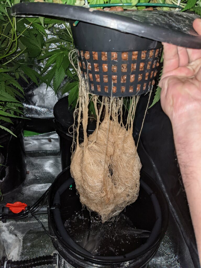
You can see how big this plant has gotten and it has developed quite a rooting system!
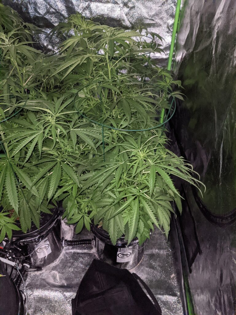
4.1.2021
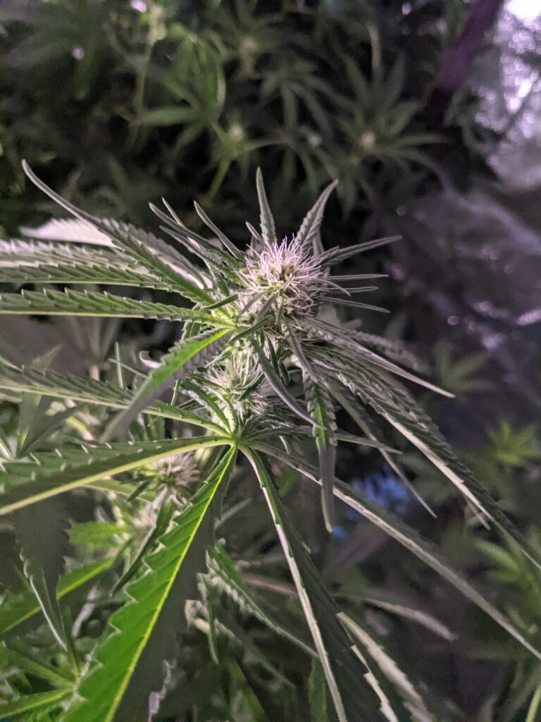
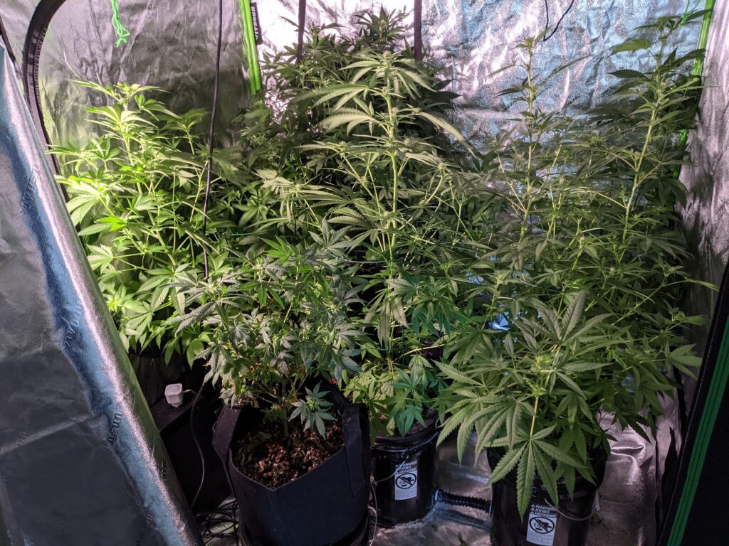
4.13.21
Buds are starting to come to life. Just a few more weeks left of flowering.


